This practical codelab is part of Unit 4: User experience in Mobile Development module. You will get the most value out of this course if you work through the codelabs in sequence:
For the complete list of codelabs in the course, see Blackboard.
For links to all the concept chapters, apps, and slides, see Android Developer Fundamentals (Version 2).
Introduction
The app bar (also called the action bar) is a dedicated space at the top of each activity screen. When you create an Activity from the Basic Activity template, Android Studio includes an app bar.
The options menu in the app bar usually provides choices for navigation, such as navigation to another activity in the app. The menu might also provide choices that affect the use of the app itself, for example ways to change settings or profile information, which usually happens in a separate activity.
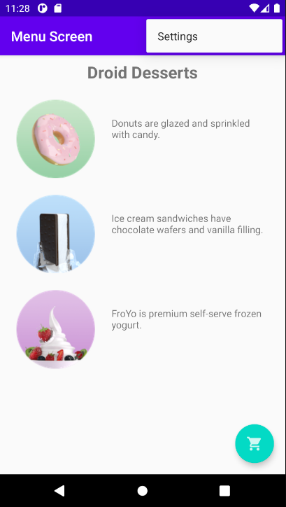
In this practical you learn about setting up the app bar and options menu in your app, as shown in the figure below.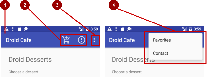
In the figure above:
- App bar. The app bar includes the app title, the options menu, and the overflow button.
- Options menu action icons. The first two options menu items appear as icons in the app bar.
- Overflow button. The overflow button (three vertical dots) opens a menu that shows more options menu items.
- Options overflow menu. After clicking the overflow button, more options menu items appear in the overflow menu.
Options menu items appear in the options overflow menu (see figure above). However, you can place some items as icons—as many as can fit—in the app bar. Using the app bar for the options menu makes your app consistent with other Android apps, allowing users to quickly understand how to operate your app and have a great experience.
You also create an app that shows a dialog to request a user's choice, such as an alert that requires users to tap OK or Cancel. A dialog is a window that appears on top of the display or fills the display, interrupting the flow of activity. Android provides ready-to-use dialogs, called pickers, for picking a time or a date. You can use them to ensure that your users pick a valid time or date that is formatted correctly and adjusted to the user's local time and date. In this lesson you'll also create an app with the date picker.
What you should already know
You should be able to:
- Create and run apps in Android Studio.
- Create and edit UI elements using the layout editor.
- Edit XML layout code, and access elements from your Java code.
- Add a click handler to a Button.
What you'll learn
- How to add menu items to the options menu.
- How to add icons for items in the options menu.
- How to set menu items to show in the app bar.
- How to add click handlers for menu items.
- How to add a dialog for an alert.
- How to add the date picker.
What you'll do
- Continue adding features to the Droid Cafe project from the previous practical.
- Add menu items to the options menu.
- Add icons for menu items to appear in the app bar.
- Connect menu-item clicks to event handlers that process the click events.
- Use an alert dialog to request a user's choice.
- Use a date picker for date input.
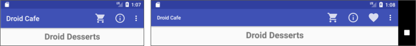
In the previous practical you created an app called Droid Cafe, shown in the figure below, using the Basic Activity template. This template also provides a skeletal options menu in the app bar at the top of the screen.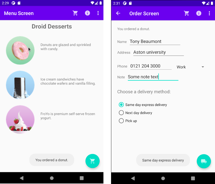
For this exercise you are using the androidx.appcompat.widget.Toolbar as an app bar, which works on the widest range of devices and also gives you room to customize your app bar later on as your app develops. A Toolbar is a generalization of action bars for use within application layouts. To read more about design considerations for using the app bar, see Responsive layout grid in the Material Design specification.
You create a new app that displays an alert dialog. The dialog interrupts the user's workflow and requires the user to make a choice.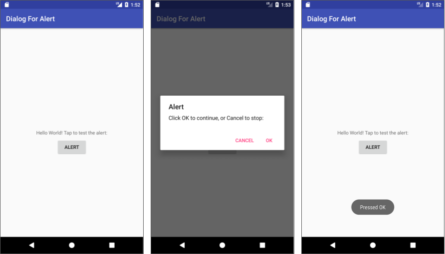
You also create an app that provides a Button to show the date picker, and converts the chosen date to a string to show in a Toast message.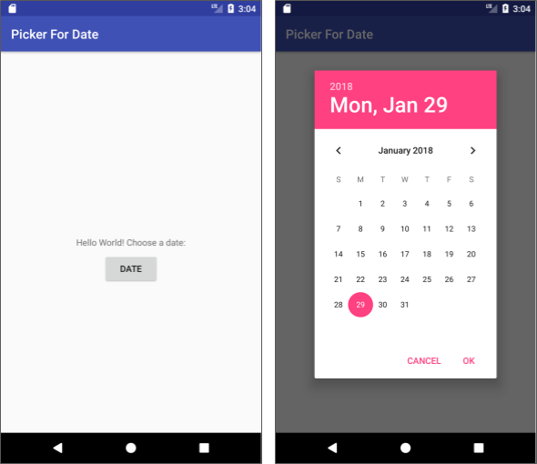
In this task you open the DroidCafeInput project from the previous practical (get a new copy from Blackboard) and add menu items to the options menu in the app bar at the top of the screen.
1.1 Examine the code
Open the DroidCafeInput app from the practical on using input controls and examine the following layout files in the res > layout folder:
- activity_main.xml: The main layout for
MainActivity, the layout components defined in this class are theAppBarLayoutwhich contains theToolbarand theFloatingActionButton. - content_main.xml: This contains the
NavHostFragmentcontrolling the navigation between the fragments, which (as you will see shortly) is included withinactivity_main.xml. - fragment_first.xml: This contains the layout for the first screen that the user sees.
- fragment_order.xml: The layout for
OrderFragment, which you added in the practical on using input controls.
Follow these steps:
- Open content_main.xml and click the Code tab to see the XML code. The
app:layout_behaviorfor theConstraintLayoutis set to@string/appbar_scrolling_view_behavior, which controls how the screen scrolls in relation to the app bar at the top. (This string resource is defined in a generated file called values.xml, which you should not edit.)
For more about scrolling behavior, see Android Design Support Library in the Android Developers Blog (although this article is not updated for androidx). For design practices involving App bars, see App bars: top in the Material Design specification. - Open activity_main.xml and click the Code tab to see the XML code for the main layout, which uses a CoordinatorLayout layout with an embedded AppBarLayout layout. The
CoordinatorLayoutand theAppBarLayouttags require fully qualified names that specifyandroidx.coordinatorlayout.widgetandcom.google.android.material.appbar.AppBarLayoutis like a verticalLinearLayout. It uses the Toolbar class in the appcompat library, instead of the native ActionBar, to implement an app bar. The Toolbar within this layout has the id toolbar, and is also specified, like theAppBarLayout, with a fully qualified name (androidx.appcompat.widget).
The app bar is a section at the top of the display that can display the activity title, navigation, and other interactive items. The nativeActionBarbehaves differently depending on the version of Android running on the device. For this reason, if you are adding an options menu, you should use the androidx appcompat widget support library's Toolbar as an app bar. Using theToolbarmakes it easy to set up an app bar that works on the widest range of devices, and also gives you room to customize your app bar later on as your app develops.Toolbarincludes the most recent features, and works for any device that can use the support library.
The activity_main.xml layout also uses aninclude layoutstatement to include the entire layout defined incontent_main.xml. This separation of layout definitions makes it easier to change the layout's content apart from the layout's toolbar definition and coordinator layout. This is a best practice for separating your content (which may need to be translated) from the format of your layout. - Run the app. Notice the bar at the top of the screen showing the title of the screen (Menu Screen). It also shows the action overflow button (three vertical dots) on the right side. Tap the overflow button to see the options menu, which at this point has only one menu option, Settings.
- Examine the AndroidManifest.xml file. The
.MainActivityactivity is set to use theNoActionBartheme. This theme is defined in thestyles.xmlfile (open app > res > values > styles.xml to see it). Styles are covered in another lesson, but you can see that theNoActionBartheme sets thewindowActionBarattribute tofalse(no window app bar), and thewindowNoTitleattribute totrue(no title). These values are set because you are defining the app bar withAppBarLayout, rather than using anActionBar. Using one of theNoActionBarthemes prevents the app from using the nativeActionBarclass to provide the app bar. - Look at MainActivity, which extends
AppCompatActivityand starts with theonCreate()method, which sets the content view to theactivity_main.xmllayout and setstoolbarto be theToolbardefined in the layout. It then calls setSupportActionBar() and passestoolbarto it, setting thetoolbaras the app bar for theActivity.
For best practices about adding the app bar to your app, see Add the app bar (not updated for androidx).
1.2 Add more menu items to the options menu
You will add the following menu items to the options menu:
- Order: Navigate to OrderActivity to see the dessert order.
- Status: Check the status of an order.
- Favorites: Show favorite desserts.
- Contact: Contact the cafe. Because you don't need the existing Settings item, you will change Settings to Contact.
Android provides a standard XML format to define menu items. Instead of building a menu in your Activity code, you can define a menu and all of its menu items in an XML menu resource. You can then inflate the menu resource (load it as a Menu object) in your Activity:
- Expand res > menu in the Project > Android pane, and open menu_main.xml. The only menu item provided from the template is
action_settings(the Settings choice), which is defined as:<item android:id="@+id/action_settings" android:orderInCategory="100" android:title="@string/action_settings" app:showAsAction="never" /> - Change the following attributes of the
action_settingsitem to make it theaction_contactitem (don't change the existingandroid:orderInCategoryattribute):Attribute
Value
android:id"@+id/action_contact"android:title"Contact"app:showAsAction"never" - Extract the hard-coded string
"Contact"into the string resourceaction_contact. - Add a new menu item using the tag within the block, and give the item the following attributes:
Attribute
Value
android:id"@+id/action_order"android:orderInCategory"10"android:title"Order"app:showAsAction"never"
Theandroid:orderInCategoryattribute specifies the order in which the menu items appear in the menu, with the lowest number appearing higher in the menu. TheContactitem is set to 100, which is a big number in order to specify that it shows up at the bottom rather than the top. You set the Order item to 10, which puts it above Contact, and leaves plenty of room in the menu for more items. - Extract the hard-coded string
"Order"into the string resourceaction_order. - Add two more menu items the same way with the following attributes:
Status item attribute
Value
android:id"@+id/action_status"android:orderInCategory"20"android:title"Status"app:showAsAction"never"Favorites item attribute
Value
android:id"@+id/action_favorites"android:orderInCategory"30"android:title"Favorites"app:showAsAction"never" - Extract
"Status"into the resourceaction_status, and"Favorites"into the resourceaction_favorites. - You will display a
Toastmessage with an action message depending on which menu item the user selects. Openstrings.xmland add the following string names and values for these messages:<string name="action_order_message">You selected Order.</string> <string name="action_status_message">You selected Status.</string> <string name="action_favorites_message">You selected Favorites.</string> <string name="action_contact_message">You selected Contact.</string> - Open MainActivity, and change the
ifstatement in theonOptionsItemSelected()method replacing the idaction_settingswith the new idaction_order:if (id == R.id.action_order)
Run the app, and tap the action overflow icon, shown on the left side of the figure below, to see the options menu, shown on the right side of the figure below. You will soon add callbacks to respond to items selected from this menu.
In the figure above:
- Tap the overflow icon in the app bar to see the options menu.
- The options menu drops down from the app bar.
Notice the order of items in the options menu. You used the android:orderInCategory attribute to specify the priority of the menu items in the menu: The Order item is 10, followed by Status (20) and Favorites (30), and Contact is last (100). The following table shows the priority of items in the menu:
Menu item |
|
|
|
|
|
|
|
|
|
Whenever possible, you want to show the most frequently used actions using icons in the app bar so the user can click them without having to first click the overflow icon. In this task, you add icons for some of the menu items, and show some of menu items in the app bar at the top of the screen as icons.
In this example, assume that the Order and Status actions are the most frequently used. The Favorites action is occasionally used, and Contact is the least frequently used. You can set icons for these actions and specify the following:
- Order and Status should always be shown in the app bar.
- Favorites should be shown in the app bar if it will fit; if not, it should appear in the overflow menu.
- Contact should not appear in the app bar; it should only appear in the overflow menu.
2.1 Add icons for menu items
To specify icons for actions, you need to first add the icons as image assets to the drawable folder using the same procedure you used in the practical on using clickable images. You want to use the following icons (or similar ones):
 Order: Use the same icon you added for the floating action button in the practical on using clickable images (ic_shopping_cart.png).
 Status:
 Favorites:
- Contact: No need for an icon because it will appear only in the overflow menu.
For the Status and Favorites icons, follow these steps:
- Expand res in the Project > Android pane, and right-click (or Control-click) the drawable folder.
- Choose New > Image Asset. The Configure Image Asset dialog appears.
- Choose Action Bar and Tab Items in the drop-down menu.
- Change ic_action_name to another name (such as ic_status_info for the Status icon).
- Click the clip art image (the Android logo next to Clipart:) to select a clip art image as the icon. A page of icons appears. Click the icon you want to use.
- Choose HOLO_DARK from the Theme drop-down menu. This sets the icon to be white against a dark-colored (or black) background. Click Next and then click Finish.
2.2 Show the menu items as icons in the app bar
To show menu items as icons in the app bar, use the app:showAsAction attribute in menu_main.xml. The following values for the attribute specify whether or not the action should appear in the app bar as an icon:
"always": Always appears in the app bar. (If there isn't enough room it may overlap with other menu icons.)"ifRoom": Appears in the app bar if there is room."never": Never appears in the app bar; its text appears in the overflow menu.
Follow these steps to show some of the menu items as icons:
- Open menu_main.xml again, and add the following attributes to the Order, Status, and Favorites items so that the first two (Order and Status) always appear, and the Favorites item appears only if there is room for it:
Order item attribute
Old value
New value
android:iconnone
"@drawable/ic_shopping_cart"app:showAsAction"never""always"Status item attribute
Old value
New value
android:iconnone
"@drawable/@drawable/ic_status_info"app:showAsAction"never""always"Favorites item attribute
Old value
New value
android:iconnone
"@drawable/ic_favorite"app:showAsAction"never""ifRoom" - Run the app. You should now see at least two icons in the app bar: the icon for Order and the icon for Status as shown on the left side of the figure below. (The Favorites and Contact options appear in the overflow menu.)
- Rotate your device to the horizontal orientation, or if you're running in the emulator, click the Rotate Left or Rotate Right icons to rotate the display into the horizontal orientation (you might have to drag down the settings and enable the screen update for rotation). You should then see all three icons in the app bar for Order, Status, and Favorites as shown on the right side of the figure below.
How many action buttons will fit in the app bar? It depends on the orientation and the size of the device screen. Fewer buttons appear in a vertical orientation, as shown on the left side of the figure above, compared to a horizontal orientation as shown on the right side of the figure above. Action buttons may not occupy more than half of the main app bar width.
In this task, you add a method to display a message about which menu item is tapped, and use the onOptionsItemSelected() method to determine which menu item was tapped.
3.1 Create a method to display the menu choice
- Open MainActivity.
- If you haven't already added the following method (in another lesson) for displaying a
Toastmessage, add it now. You will use it as the action to take for each menu choice. (Normally you would implement an action for each menu item such as displaying a differentFragment, as shown later in this lesson.)public void displayToast(String message) { Toast.makeText(getApplicationContext(), message, Toast.LENGTH_SHORT).show(); }
3.2 Use the onOptionsItemSelected event handler
The onOptionsItemSelected() method handles selections from the options menu. You will add a switch case block to determine which menu item was selected and what action to take.
- Find the
onOptionsItemSelected()method provided by the template. The method determines whether a certain menu item was clicked, using the menu item'sid. In the example below, theidisaction_order:@Override public boolean onOptionsItemSelected(MenuItem item) { int id = item.getItemId(); if (id == R.id.action_order) { return true; } return super.onOptionsItemSelected(item); } - Replace the
int idassignment statement and theifstatement with the followingswitch caseblock, which sets the appropriatemessagebased on the menu item'sid:@Override public boolean onOptionsItemSelected(MenuItem item) { switch (item.getItemId()) { case R.id.action_order: displayToast(getString(R.string.action_order_message)); return true; case R.id.action_status: displayToast(getString(R.string.action_status_message)); return true; case R.id.action_favorites: displayToast(getString(R.string.action_favorites_message)); return true; case R.id.action_contact: displayToast(getString(R.string.action_contact_message)); return true; default: // Do nothing } return super.onOptionsItemSelected(item); } - Run the app. Click on each of your four menu option in turn, Order, Status, Favorites and Contact. You should now see a different
Toastmessage on the screen depending on which menu item you choose.
3.3 Display a new Fragment from a menu item
Normally you would implement an action for each menu item, such as displaying another Fragment.
- Open your nav_graph.xml and click the Design tab
- Add a new destination and call it
StatusFragmentand check that itsandroid:idis set to@+id/statusFragmentand set itsandroid:labelto"Status Screen" - Referring to the code for
onOptionsItemSelectedfrom the previous task, change the code for theaction_statuscase to the following, which displaysStatusFragment(using the same code you used for the floating action button in the lesson on using clickable images):
Run the app. Clicking the status icon in the app bar takes you directly to theswitch (item.getItemId()) { case R.id.action_status: navController.navigate(R.id.statusFragment); return true; // ... code for other cases }StatusFragmentscreen.
The FloatingActionButton (FAB) needs to be handled because it is managed by the Firstfragment and will cause an error if we click it while the StatusFragment is showing. In the next few steps we will hide the FAB.
- Open StatusFragment.java and remove any code that was automatically generated to handle parameters to the fragment. We have no need to handle parameters. The only code we need is the following:
public class StatusFragment extends Fragment { @Override public void onCreate(Bundle savedInstanceState) { super.onCreate(savedInstanceState); } @Override public View onCreateView(LayoutInflater inflater, ViewGroup container, Bundle savedInstanceState) { // Inflate the layout for this fragment return inflater.inflate(R.layout.fragment_status, container, false); } } - Add an instance variable to
StatusFragmenthold a reference to the FAB:private FloatingActionButton fab; - We have a number of options to get the reference to the FAB from the
StatusFragment. The FAB itself has been created when theMainActivitywas started, and since all of our fragments exist inside the layout of theMainActivity, we can obtain a reference to the FAB as soon as theStatusFragmentis attached. The sequence of lifecycle event callback functions in a fragment is;onAttach,onCreate,onCreateView,onViewCreated,onStart,onResume. AfteronResume, the user can interact with the screen. We will get our reference to the FAB insideonCreateView:@Override public View onCreateView(LayoutInflater inflater, ViewGroup container, Bundle savedInstanceState) { // Inflate the layout for this fragment fab = getActivity().findViewById(R.id.fab); return inflater.inflate(R.layout.fragment_status, container, false); } - We should not hide the FAB in
onCreateViewbecause we need to show the FAB again when theStatusFragmentis stopped and re-hidden if the user returns to theStatusFragment. We need to ensure that ourhide/showmechanism supports the user navigating to another APP and then returning to our APP while theStatusFragmentis being displayed. We will choose to hide the FAB in theonResumemethod. Add this method to yourStatusFragment:@Override public void onResume() { super.onResume(); fab.hide(); } - When we navigate back to the
FirstFragmentfrom theStatusFragment, the FAB will remain hidden unless we show it again. As theStatusFragmenthid the FAB, it should also be responsible for restoring the FAB whenStatusFragmentis closed. The options for when to restore the FAB to the screen are either inonPauseor inonStop. If we restore the FAB inonPause, the FAB will become visible in the case when the user clicks the button to show the list of running APPs on the device. Therefore the best place to restore the FAB is in theonStopfunction:@Override public void onStop() { super.onStop(); fab.show(); } - Run your APP now. The FAB should disappear while the
StatusFragmentis displayed, but be restored when you navigate away and back to theFirstFragment.
The OrderFragment also needs to control the FAB. Currently, clicking the FAB on the order screen will lead to an error because the handler is still managed by the FirstFragment which is not currently active. Lets update the OrderFragment in a similar way to the StatusFragment. We will change the FAB icon to a shipping icon, display a Toast as a placeholder for recording the order details, and then make it navigate back to the FirstFragment.
- Right click res > drawable and select New > Image Asset. Select the
 and set its name to
 ic_shipping. - We need a reference to the FAB and also a reference to the old icon displayed in the FAB before we changed it so that we can later restore the old icon when
OrderFragmentcloses. Add the following two instance variables to your OrderFragment:private FloatingActionButton fab; private Drawable fabIcon; - Add the following code to the
onViewCreatedmethod of yourOrderFragment. This will obtain the reference to the FAB, save a reference to the previous drawable (so we can restore it later), and replace the FAB icon with theic_shippingicon. We also provide anOnClickListenerwhich will simulate saving the order by displaying aToast, and then navigate back to the previous screen:fab = getActivity().findViewById(R.id.fab); fabIcon = fab.getDrawable(); fab.setImageResource(R.drawable.ic_shipping); fab.setOnClickListener(new View.OnClickListener() { @Override public void onClick(View view) { Toast.makeText(getContext(),"Order Delivery Saved", Toast.LENGTH_SHORT).show(); NavHostFragment.findNavController(OrderFragment.this).popBackStack(); } }); - We will restore the previous FAB icon in the
onStopmethod of theOrderFragment:@Override public void onStop() { super.onStop(); fab.setImageDrawable(fabIcon); } - Run your app now. The
OrderFragmentshould display theic_shippingicon and clicking the FAB in theOrderFragmentshould take you back to theFirstFragment. We popped the navigation stack so theOnClickListenerfor theFirstFragmentshould be automatically restored.
3.4 Alter an App bar action from a Fragment
In this step you will make action_order be handled differently when the FirstFragment is displayed. The MainActivity will check that the FirstFragment is not displayed when handling action_order. The result will be that when action_order is invoked when FirstFragmentis displayed, the APP will to navigate to the OrderFragment. Otherwise if FirstFragment is not displayed, action_order will be handled by MainActivity and will cause the APP to navigate to FirstFragment.
- Open MainActivity.java and modify the
onOptionsItemSelectedto make the navigation toR.id.FirstFragmentbe conditional onFirstFragmentnot being displayed:public boolean onOptionsItemSelected(MenuItem item) { switch (item.getItemId()) { case R.id.action_order: if (navController.getCurrentDestination().getId() != R.id.FirstFragment) { displayToast(getString(R.string.action_order_message)); navController.navigate(R.id.FirstFragment); return true; } else { return super.onOptionsItemSelected(item); } // Other cases omitted } } - Open FirstFragment.java and make the
onCreatemethod set that the fragment has an options menu:@Override public void onCreate(@Nullable Bundle savedInstanceState) { super.onCreate(savedInstanceState); setHasOptionsMenu(true); } - Override onOptionsItemSelected in FirstFragment to make R.id.action_order can the APP to navigate to OrderFragment:
@Override public boolean onOptionsItemSelected(@NonNull MenuItem item) { switch (item.getItemId()) { case R.id.action_order: placeOrder(); return true; default: } return super.onOptionsItemSelected(item); } private void placeOrder() { FirstFragmentDirections.PlaceOrder action = FirstFragmentDirections.placeOrder(); if (mOrderMessage.length() > 0) { action.setOrderText(mOrderMessage); } NavHostFragment.findNavController(FirstFragment.this) .navigate(action); } - You can optionally also update the FAB
OnClickListenerinFirstFragment.onViewCreatedto callplaceOrderand remove the duplicated code:fab.setOnClickListener(new View.OnClickListener() { @Override public void onClick(View view) { placeOrder(); } }); - Run your APP. You should now see that the
action_order(clicking the shopping trolley icon) on the action bar behaves differently depending on which fragment is currently displayed.
You can provide a dialog to request a user's choice, such as an alert that requires users to tap OK or Cancel. A dialog is a window that appears on top of the display or fills the display, interrupting the flow of activity.
For example, an alert dialog might require the user to click Continue after reading it, or give the user a choice to agree with an action by clicking a positive button (such as OK or Accept), or to disagree by clicking a negative button (such as Cancel). Use the AlertDialog subclass of the Dialog class to show a standard dialog for an alert.
In this practical, you use a Button to trigger a standard alert dialog. In a real-world app, you might trigger an alert dialog based on some condition, or based on the user tapping something.
4.1 Create a new app to show an alert dialog
In this exercise, you build an alert with OK and Cancel buttons. The alert is triggered by the user tapping the FAB.
- Create a new project called Dialog For Alert based on the Basic Activity template so that the design already includes a
Buttonin theFirstFragment. - Open FirstFragment.java and you will see that the
Buttonalready has anonClickhandler attached:
If you run the APP you will see the following screen:public void onViewCreated(@NonNull View view, Bundle savedInstanceState) { super.onViewCreated(view, savedInstanceState); view.findViewById(R.id.button_first).setOnClickListener(new View.OnClickListener() { @Override public void onClick(View view) { NavHostFragment.findNavController(FirstFragment.this) .navigate(R.id.action_FirstFragment_to_SecondFragment); } }); }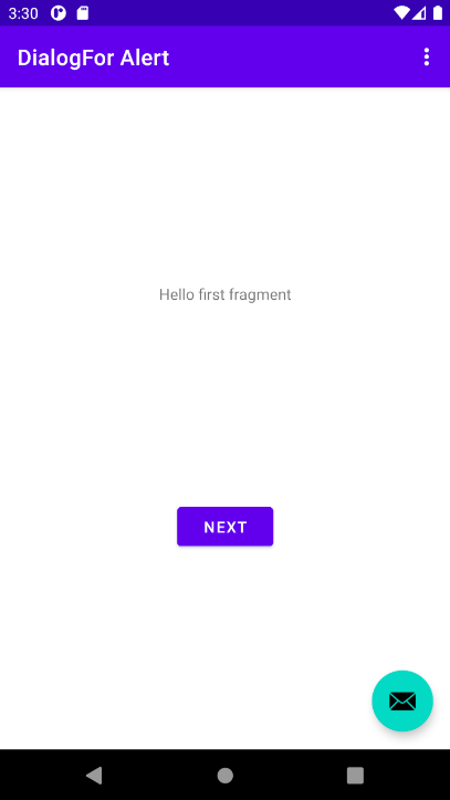
4.2 Add an alert dialog to the FirstFragment
The builder design pattern makes it easy to create an object from a class that has a lot of required and optional attributes and would therefore require a lot of parameters to build. Without this pattern, you would have to create constructors for combinations of required and optional attributes; with this pattern, the code is easier to read and maintain. For more information about the builder design pattern, see Builder pattern.
The builder class is usually a static member class of the class it builds. Use AlertDialog.Builder to build a standard alert dialog, with setTitle() to set its title, setMessage() to set its message, and setPositiveButton() and setNegativeButton() to set its buttons.
To make the alert, you need to make an object of AlertDialog.Builder. You will add the onClickShowAlert() click handler for the NextButton, which makes this object as its first order of business. That means that the dialog will be created only when the user clicks the NextButton. While this coding pattern is logical for using a Button to test an alert, for other apps you may want to create the dialog in the onCreate() method so that it is always available for other code to trigger it.
- Open FirstFragment.java and edit the onClick() method as follows (comment the
navigatecode rather than delete it because we will need it as the action when the user clicks the OK button):
Ifpublic void onClick(View view) { AlertDialog.Builder myAlertBuilder = new AlertDialog.Builder(getContext()); // Set the dialog title and message. //NavHostFragment.findNavController(FirstFragment.this) // .navigate(R.id.action_FirstFragment_to_SecondFragment); }AlertDialog.Builderis not recognized as you enter it, click the red light bulb icon, and choose the androidx support library version (androidx.appcompat.app.AlertDialog) for importing into your Fragment. - Add the code to set the title and the message for the alert dialog to
onClick()after the comment:public void onClick(View view) { AlertDialog.Builder myAlertBuilder = new AlertDialog.Builder(getContext()); // Set the dialog title and message. myAlertBuilder.setTitle("Alert"); myAlertBuilder.setMessage("Click OK to continue, or Cancel to stop:"); // Add the dialog buttons. //NavHostFragment.findNavController(FirstFragment.this) // .navigate(R.id.action_FirstFragment_to_SecondFragment); } - Extract the strings above to string resources as
alert_titleandalert_message. - Add the OK and Cancel buttons to the alert with
setPositiveButton()andsetNegativeButton()methods:
After the user taps the OK or Cancel button in the alert, you can grab the user's selection and use it in your code. In this example, you navigate topublic void onClick(View view) { AlertDialog.Builder myAlertBuilder = new AlertDialog.Builder(getContext()); // Set the dialog title and message. myAlertBuilder.setTitle(R.string.alert_title); myAlertBuilder.setMessage(R.string.alert_message); // Add the dialog buttons. myAlertBuilder.setPositiveButton("OK", new DialogInterface.OnClickListener() { public void onClick(DialogInterface dialog, int which) { // User clicked OK button. NavHostFragment.findNavController(FirstFragment.this) .navigate(R.id.action_FirstFragment_to_SecondFragment); } }); myAlertBuilder.setNegativeButton("Cancel", new DialogInterface.OnClickListener() { public void onClick(DialogInterface dialog, int which) { // User cancelled the dialog. Toast.makeText(getContext(), "Pressed Cancel", Toast.LENGTH_SHORT).show(); } }); // Create and show the AlertDialog. }SecondFragment(using the originalnavigatecode) when the user clicks the OK button, and display a Toast message when the user clicks Cancel. - Extract the strings for OK and Cancel to string resources as
ok_buttonandcancel_button, and extract the string for theToastmessage. - At the end of the
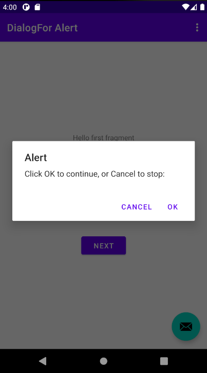
onClick()method, addshow(), which creates and then displays the alert dialog:// Create and show the AlertDialog. myAlertBuilder.show(); - Run the app.
You should be able to tap the Next button, to see the alert dialog, shown in the figure below. The dialog shows OK and Cancel buttons. Clicking OK takes you to SecondFragment and clicking Cancel causes a Toast message to appear.
Android provides ready-to-use dialogs, called pickers, for picking a time or a date. You can use them to ensure that your users pick a valid time or date that is formatted correctly and adjusted to the user's local time and date. Each picker provides controls for selecting each part of the time (hour, minute, AM/PM) or date (month, day, year). You can read all about setting up pickers in Pickers.
In this task you'll create a new project and add the date picker. You will also learn how to use a Fragment, which is a behavior or a portion of a UI within an Activity. It's like a mini-Activity within the main Activity, with its own lifecycle, and it's used for building a picker. All the work is done for you. To learn about the Fragment class, see Fragments in the API Guide.
One benefit of using a Fragment for a picker is that you can isolate the code sections for managing the date and the time for various locales that display date and time in different ways. The best practice to show a picker is to use an instance of DialogFragment, which is a subclass of Fragment. A DialogFragment displays a dialog window floating on top of the Activity window. In this exercise, you'll add a Fragment for the picker dialog and use DialogFragment to manage the dialog lifecycle.
5.1 Create a new app to show a date picker
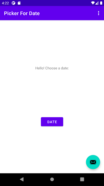
To start this task, create an app that provides a Button to show the date picker.
- Create a new project called Picker For Date based on the Basic Activity template.
- Open the fragment_first.xml layout file to show the layout editor. Notice that the
TextViewcontains the text referred to by@string/hello_first_fragment - Open strings.xml and edit the string whose name is
hello_first_fragmentto change its value fromHello first fragmentto Hello! Choose a date: - Notice that the
Buttoninfragment_first.xmldisplays the text referred to by@string/next - In strings.xml, change the value of the string whose name is next to become:
<string name="date">Date</string> - Edit the android:text attribute of the Button to be
android:text="@string/date" - If you run the APP, you should see the following screen (we will change the action of the button in the next step):
5.2 Create a new fragment for the date picker
In this step, you add a Fragment for the date picker.
- Expand app > java > uk.aston.pickerfordate and select FirstFragment.
Choose File > New > Fragment > Fragment (Blank), and name the fragment DatePickerFragment. You don't need to create a layout for a standard picker but Android Studio doesn't let us not create an XML layout file. Allow it to be created and we will delete it in a later step. Click Finish. - Open DatePickerFragment and edit the
DatePickerFragmentclass definition toextend DialogFragmentandimplementDatePickerDialog.OnDateSetListener to create a standard date picker with a listener. Delete all of the automatically generated code inside the class. See Pickers for more information about extendingDialogFragmentfor a date picker:
As you enterpublic class DatePickerFragment extends DialogFragment implements DatePickerDialog.OnDateSetListener { // to be completed... }DialogFragmentandDatePickerDialog.OnDateSetListener, Android Studio automatically adds several import statements to the import block at the top. IfDialogFragmenthas more than one import option, make sure you import it fromandroidx.fragment.app.DialogFragment. Your import statements should look like this:
In addition, a red bulb icon appears in the left margin after a few seconds.import android.app.DatePickerDialog; import androidx.fragment.app.DialogFragment; import androidx.fragment.app.Fragment; - Click the red bulb icon and choose Implement methods from the popup menu. A dialog appears with onDateSet() already selected and the Insert @Override option selected. Click OK to create the empty
onDateSet()method. This method will be called when the user sets the date.
After adding the emptyonDateSet()method, Android Studio automatically adds the following in the import block at the top:
Theimport android.widget.DatePicker;onDateSet()parameters should beint i,int i1, andint i2. Change the names of these parameters to ones that are more readable:public void onDateSet(DatePicker datePicker, int year, int month, int day) - Add a method called onCreateDialog() that returns
Dialog, and annotateonCreateDialog()with@NonNullto indicate that thereturnvalueDialogcan't benull. Android Studio displays a red bulb next to the method because it doesn'treturnanything yet.@NonNull @Override public Dialog onCreateDialog(Bundle savedInstanceState) { } - Add the following code to
onCreateDialog()to initialize theyear,month, anddayfrom Calendar, and return the dialog and these values to theFragment. As you enterCalendar.getInstance(), specify the import to bejava.util.Calendar.
5.4 Modify the FirstFragment
While much of the code in FirstFragment.java stays the same, you need to edit a method that creates an instance of FragmentManager to manage the Fragment and show the date picker.
- Open FirstFragment.
- Edit the onClick handler for the Date
Button(button_first). It should create an instance ofFragmentManagerusinggetChildFragmentManager()to manage theFragmentautomatically, and to show the picker. For more information about theFragmentclass, see Fragments.public void onClick(View view) { DialogFragment newFragment = new DatePickerFragment(); newFragment.show(getChildFragmentManager(),"datePicker"); } - Extract the string
"datePicker"to the string resourcedatepicker. - Run the app. You should see the date picker after tapping the Date button.
5.5 Use the chosen date
In this step you pass the date back to FirstFragment.java, and convert the date to a string that you can show in a Toast message.
- Open FirstFragment and add an empty
processDatePickerResult()method that takes theyear,month, anddayas arguments:public void processDatePickerResult(int year, int month, int day) { } - Add the following code to the
processDatePickerResult()method to convert themonth,day, andyearto separate strings, and to concatenate the three strings with slash marks for the UK date format:
TheString month_string = Integer.toString(month+1); String day_string = Integer.toString(day); String year_string = Integer.toString(year); String dateMessage = (day_string + "/" + month_string + "/" + year_string);monthinteger returned by the date picker starts counting at 0 for January, so you need to add 1 to it to show months starting at 1. - Add the following after the code above to display a
Toastmessage:Toast.makeText(getContext, "Date: " + dateMessage, Toast.LENGTH_SHORT).show(); - Extract the hard-coded string
"Date: "into a string resource nameddate_prompt. - Open
DatePickerFragment, and add the following to theonDateSet()method to invokeprocessDatePickerResult()inFirstFragmentand pass it theyear,month, andday:
You use@Override public void onDateSet(DatePicker datePicker, int year, int month, int day) { FirstFragment fragment = (FirstFragment) this.getParentFragment(); fragment.processDatePickerResult(year, month, day); }getParentFragment()which, when used in aFragment, returns the parentFragmentthat thisFragmentis currently associated with. You need this because you can't call a method inFirstFragment. The childFragmentinherits the context, so you can use it as the context for calling the method (as infragment.processDatePickerResult). - Run the app, the figure below shows the date picker dialog that appears after you click the Date button. After selecting the date and clicking OK, the chosen date appears in a
Toastmessage.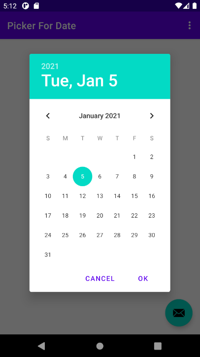
Provide an options menu and app bar:
- Start your app or
Activitywith the Basic Activity template to automatically set up the app bar, the options menu, and a floating action button. - The template sets up a
CoordinatorLayoutlayout with an embeddedAppBarLayoutlayout.AppBarLayoutis like a verticalLinearLayout. It uses theToolbarclass in the support library, instead of the nativeActionBar, to implement an app bar. - The template modifies the
AndroidManifest.xmlfile so that the .MainActivityActivity is set to use theNoActionBartheme. This theme is defined in thethemes.xmlfile. - The template sets
MainActivityto extendAppCompatActivityand starts with theonCreate()method, which sets the content view and Toolbar. It then callssetSupportActionBar()and passes toolbar to it, setting the toolbar as the app bar for theActivity. - Define menu items in the
menu_main.xmlfile. Theandroid:orderInCategoryattribute specifies the order in which the menu items appear in the menu, with the lowest number appearing higher in the menu. - Use the
onOptionsItemSelected()method to determine which menu item was tapped.
Add an icon for an options menu item:
- Expand res in the Project > Android pane, and right-click (or Control-click) the drawable folder. Choose New > Image Asset.
- Choose Action Bar and Tab Items in the drop-down menu, and change the name of the image file.
- Click the clip art image to select a clip art image as the icon. Choose an icon.
- Choose HOLO_DARK from the Theme drop-down menu.
Show menu items as icons in the app bar:
- Use the
app:showAsActionattribute inmenu_main.xmlwith the following values."always": Always appears in the app bar. (If there isn't enough room it may overlap with other menu icons.)"ifRoom": Appears in the app bar if there is room."never": Never appears in the app bar; its text appears in the overflow menu.
Use an alert dialog:
- Use a dialog to request a user's choice, such as an alert that requires users to tap OK or Cancel. Use dialogs sparingly as they interrupt the user's workflow.
- Use the
AlertDialogsubclass of theDialogclass to show a standard dialog for an alert. - Use
AlertDialog.Builderto build a standard alert dialog, withsetTitle()to set its title,setMessage()to set its message, andsetPositiveButton()andsetNegativeButton()to set its buttons.
Use a picker for user input:
- Use
DialogFragment, a subclass ofFragment, to build a picker such as the date picker or time picker. - Create a
DialogFragment, andimplement DatePickerDialog.OnDateSetListenerto create a standard date picker with a listener. IncludeonDateSet()in thisFragment. - Delete any auto-generated code inside your
DialogFragmentsubclass and addonCreateDialog()that returnsDialog. Initialize the date for the date picker fromCalendar, and return the dialog and these values to the Activity. - Create an instance of
FragmentManagerusinggetChildFragmentManager()to manage theFragmentand show the date picker.
The related concept documentation is in 4.3: Menus and pickers.
Android Studio documentation:
Android developer documentation:
- Add the app bar
- Menus
- Toolbar
- androidx appcompat support library
- AppBarLayout
- onOptionsItemSelected()
- View
- MenuInflater
- registerForContextMenu()
- onCreateContextMenu()
- onContextItemSelected()
- Dialogs
- AlertDialog
- Pickers
- Fragments
- DialogFragment
- FragmentManager
- Calendar
Material Design spec:
Other:
- Android Developers Blog: Android Design Support Library
- Builder pattern in Wikipedia