This practical codelab is part of Unit 4: User experience in Mobile Development You will get the most value out of this course if you work through the codelabs in sequence:
For details about the course, including links to all the concept chapters, apps, codelabs and slides, see Blackboard.
Introduction
To enable the user to enter text or numbers, you use an EditText element. Some input controls are EditText attributes that define the type of keyboard that appears, to make entering data easier for users. For example, you might choose phone for the android:inputType attribute to show a numeric keypad instead of an alphanumeric keyboard.
Other input controls make it easy for users to make choices. For example, RadioButton elements enable a user to select one (and only one) item from a set of items.
In this practical, you use attributes to control the on-screen keyboard appearance, and to set the type of data entry for an EditText. You also add radio buttons to the DroidCafe app so the user can select one item from a set of items.
What you should already know
You should be able to:
- Create an Android Studio project from a template and generate the main layout.
- Run apps on the emulator or a connected device.
- Create and edit UI elements using the layout editor and XML code.
- Access UI elements from your code using
findViewById(). - Convert the text in a
Viewto a string usinggetText(). - Create a click handler for a
Buttonclick. - Display a
Toastmessage.
What you'll learn
- How to change the input methods to enable suggestions, auto-capitalization, and password obfuscation.
- How to change the generic on-screen keyboard to a phone keypad or other specialized keyboards.
- How to add radio buttons for the user to select one item from a set of items.
- How to add a spinner to show a drop-down menu with values, from which the user can select one.
What you'll do
- Show a keyboard for entering an email address.
- Show a numeric keypad for entering phone numbers.
- Allow multiple-line text entry with automatic sentence capitalization.
- Add radio buttons for selecting an option.
- Set an
onClickhandler for the radio buttons. - Add a spinner for the phone number field for selecting one value from a set of values.
In this practical, you add more features to the DroidCafe app from the lesson on using clickable images.
In the app's OrderFragment you experiment with the android:inputType attribute for EditText elements. You add EditText elements for a person's name and address, and use attributes to define single-line and multiple-line elements that make suggestions as you enter text. You also add an EditText that shows a numeric keypad for entering a phone number.
Other types of input controls include interactive elements that provide user choices. You add radio buttons to DroidCafe for choosing only one delivery option from several options. You also offer a spinner input control for selecting the label (Home, Work, Other, Custom) for the phone number.
Touching an EditText editable text field places the cursor in the text field and automatically displays the on-screen keyboard so that the user can enter text.
An editable text field expects a certain type of text input, such as plain text, an email address, a phone number, or a password. It's important to specify the input type for each text field in your app so that the system displays the appropriate soft input method, such as an on-screen keyboard for plain text, or a numeric keypad for entering a phone number.
1.1 Add an EditText for entering a name
In this step you add a TextView and an EditText to the OrderFragment layout in the DroidCafe app so that the user can enter a person's name.
- Make a copy of the DroidCafe app from the lesson on using clickable images, and rename the copy to DroidCafeInput (or download the starter app from Blackboard). If you didn't complete the coding challenge in that lesson, download the starter project from Blackboard.
- Open the fragment_order.xml layout file, which uses a
FrameLayout. Replace the FrameLayout element with a Constraintlayout. The code should look like this:<?xml version="1.0" encoding="utf-8"?> <androidx.constraintlayout.widget.ConstraintLayout xmlns:android="http://schemas.android.com/apk/res/android" xmlns:tools="http://schemas.android.com/tools" android:layout_width="match_parent" android:layout_height="match_parent" tools:context=".OrderFragment"> <TextView android:id="@+id/order_text" android:layout_width="match_parent" android:layout_height="match_parent" android:text="This is the Order Fragment" /> </androidx.constraintlayout.widget.ConstraintLayout> - Change the
layout_widthand thelayout_heightof the existingTextViewcalledorder_textto set their values towrap_content. - Attach the top of that
TextViewto the top of the layout and the left side to the left of the layout and set the margins on the top and left to 24.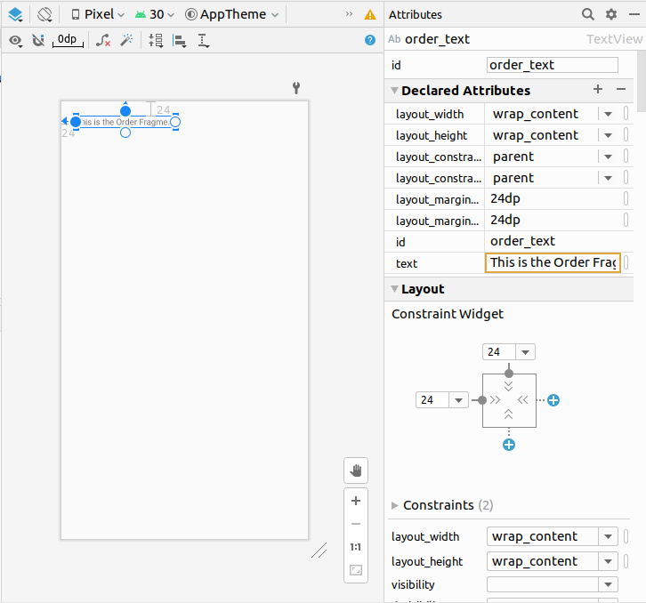
- Add a
TextViewto theConstraintLayoutinfragment_order.xmlunder theorder_textviewelement already in the layout. Use the following attributes for the new TextView:Attribute
Value
id@+id/name_labelandroid:layout_widthwrap_contentandroid:layout_heightwrap_contentandroid:layout_marginStart24dpandroid:layout_marginLeft24dpandroid:layout_marginTop32dpandroid:textNameapp:layout_constraintStart_toStartOfparentapp:layout_constraintTop_toBottomOf@+id/order_text - Extract the string resource for the
android:textattribute value to create and entry for it called name_label_text in strings.xml. - Add an
EditTextelement. To use the visual layout editor, drag a Plain Text element from the Palette pane to a position next to thename_labelTextView. Then entername_textfor the ID field, and constrain the left side and baseline of the element to thename_labelelement right side and baseline as shown in the figure below (you may need to right click theEditTextand select Show Baseline before you can align the baselines):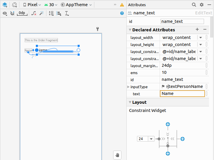
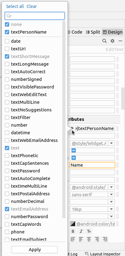
- The figure above highlights the inputType field in the Attributes pane to show that Android Studio automatically assigned the textPersonName type. Click the flag in the inputType field to see the menu of input types:
In the figure above, textPersonName is selected as the input type. - Add a hint for text entry, such as Enter your name, in the hint field in the Attributes pane, and delete the Name entry in the text field. As a hint to the user, the text "Enter your name" should be dimmed inside the
EditText. - Check the XML code for the layout by clicking the Code tab. Extract the string resource for the
android:hintattribute value to enter_name_hint. The following attributes should be set for the newEditText(add thelayout_marginLeftattribute for compatibility with older versions of Android):Attribute
Value
id@+id/name_textandroid:layout_widthwrap_contentandroid:layout_heightwrap_contentandroid:layout_marginStart8dpandroid:layout_marginLeft8dpandroid:ems10android:hint@string/enter_name_hintandroid:inputTypetextPersonNameapp:layout_constraintBaseline_toBaselineOf@+id/name_labelapp:layout_constraintStart_toEndOf@+id/name_label
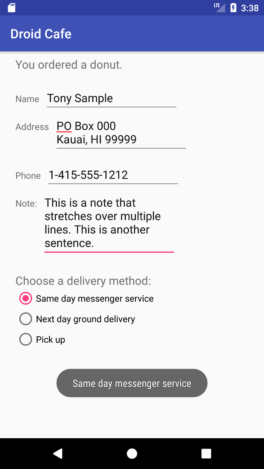
As you can see in the XML code, theandroid:inputTypeattribute is set totextPersonName. - Run the app. Tap the donut image on the first screen, and then tap the floating action button to see the next Fragment. Tap inside the text entry field to show the keyboard and enter text, as shown in the figure below.
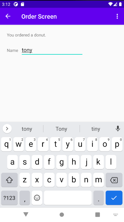
Note that suggestions automatically appear for words that you enter. Tap a suggestion to use it. This is one of the properties of the textPersonName value for the android:inputType attribute. The inputType attribute controls a variety of features, including keyboard layout, capitalization, and multiple lines of text. - To close the keyboard, tap the checkmark icon in the blue box
 , which appears in the lower right corner of the keyboard. This is known as the Done key.
1.2 Add a multiple-line EditText
In this step you add another EditText to the OrderFragment layout in the DroidCafe app so that the user can enter an address using multiple lines.
- Open the fragment_order.xml layout file if it is not already open.
- Add a
TextViewunder thename_labelelement already in the layout. Use the following attributes for the newTextView:Attribute
Value
android:id@+id/address_labelandroid:layout_widthwrap_contentandroid:layout_heightwrap_contentandroid:layout_marginStart24dpandroid:layout_marginLeft24dpandroid:layout_marginTop24dpandroid:textAddressapp:layout_constraintStart_toStartOfparentapp:layout_constraintTop_toBottomOf@+id/name_label - Extract the string resource for the
android:textattribute value to create and entry for it calledaddress_label_textinstrings.xml. - Add an
EditTextelement. To use the visual layout editor, drag a Multiline Text element from the Palette pane to a position next to the address_label TextView. Then enter address_text for the ID field, and constrain the left side and baseline of the element to theaddress_labelelement right side and baseline as shown in the figure below: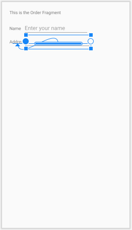
- Add a hint for text entry, such as Enter address, in the hint field in the Attributes pane. As a hint to the user, the text "Enter address" should be dimmed inside the
EditText. - Check the XML code for the layout by clicking the Code tab. Extract the string resource for the
android:hintattribute value toenter_address_hint. The following attributes should be set for the newEditText(add thelayout_marginLeftattribute for compatibility with older versions of Android):<EditText android:id="@+id/address_text" android:layout_width="wrap_content" android:layout_height="wrap_content" android:layout_marginStart="8dp" android:layout_marginLeft="8dp" android:ems="10" android:gravity="start|top" android:hint="@string/enter_address_hint" android:inputType="textMultiLine" app:layout_constraintBaseline_toBaselineOf="@+id/address_label" app:layout_constraintStart_toEndOf="@+id/address_label" /> - Run the app. Tap an image on the first screen, and then tap the floating action button to see the next
Fragment. - Tap inside the "Address" text entry field to show the keyboard and enter text, as shown in the figure below, using the Return key
 in the lower right corner of the keyboard (also known as the Enter or New Line key) to start a new line of text. The Return key appears if you set the
 textMultiLinevalue for theandroid:inputTypeattribute.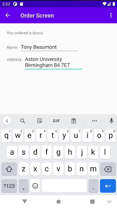
- To close the keyboard, tap the down-arrow button that appears instead of the Back button in the bottom row of buttons.
1.3 Use a keypad for phone numbers
In this step you add another EditText to the OrderFragment layout in the DroidCafe app so that the user can enter a phone number on a numeric keypad.
- Open the fragment_order.xml layout file if it is not already open.
- Add a
TextViewunder theaddress_labelelement already in the layout. Use the following attributes for the newTextView:Attribute
Value
android:id@+id/phone_labelandroid:layout_widthwrap_contentandroid:layout_heightwrap_contentandroid:layout_marginStart24dpandroid:layout_marginLeft24dpandroid:layout_marginTop24dpandroid:textPhoneapp:layout_constraintStart_toStartOfparentapp:layout_constraintTop_toBottomOf@+id/address_text
Note that thisTextViewis constrained to the bottom of the multiple-lineEditText(address_text). This is becauseaddress_textcan grow to multiple lines, and thisTextViewshould appear beneath it. - Extract the string resource for the
android:textattribute value to create and entry for it calledphone_label_textinstrings.xml. - Add an
EditTextelement. To use the visual layout editor, drag a Phone element from the Palette pane to a position next to thephone_labelTextView. Then enter phone_text for the ID field, and constrain the left side and baseline of the element to thephone_labelelement right side and baseline as shown in the figure below: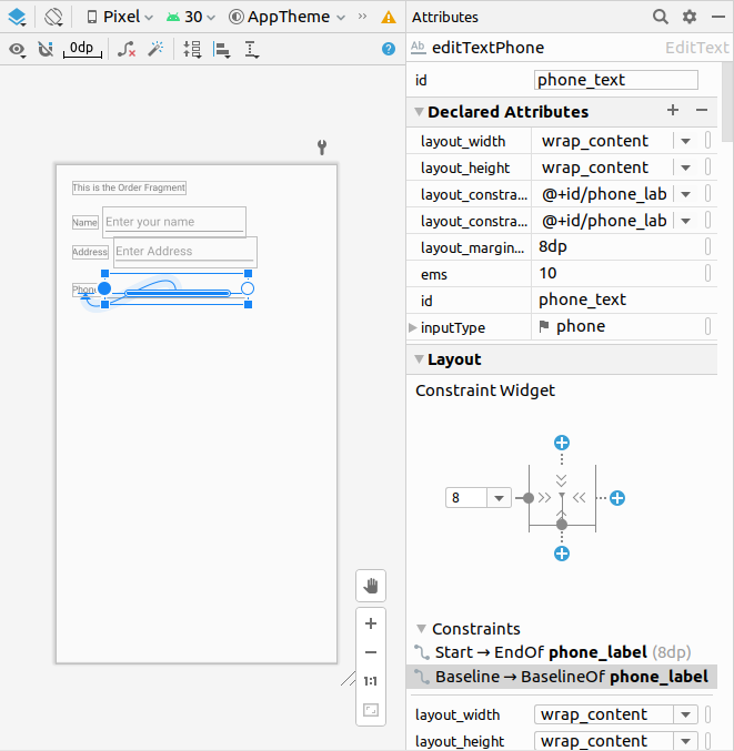
- Add a hint for text entry, such as Enter phone, in the hint field in the Attributes pane. As a hint to the user, the text "Enter phone" should be dimmed inside the
EditText. - Check the XML code for the layout by clicking the Code tab. Extract the string resource for the
android:hintattribute value toenter_phone_hint. The following attributes should be set for the new EditText (add the layout_marginLeft attribute for compatibility with older versions of Android):<EditText android:id="@+id/phone_text" android:layout_width="wrap_content" android:layout_height="wrap_content" android:layout_marginStart="8dp" android:layout_marginLeft="8dp" android:ems="10" android:hint="@string/enter_phone_hint" android:inputType="phone" app:layout_constraintBaseline_toBaselineOf="@+id/phone_label" app:layout_constraintStart_toEndOf="@+id/phone_label" /> - Run the app. Tap an image on the first screen, and then tap the floating action button to see the next
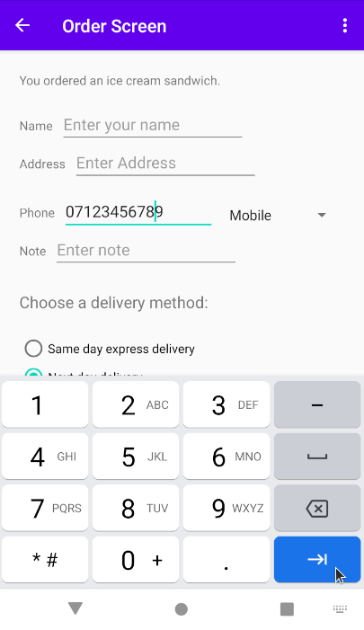
Fragment. - Tap inside the "Phone" field to show the numeric keypad. You can then enter a phone number, as shown in the figure below.
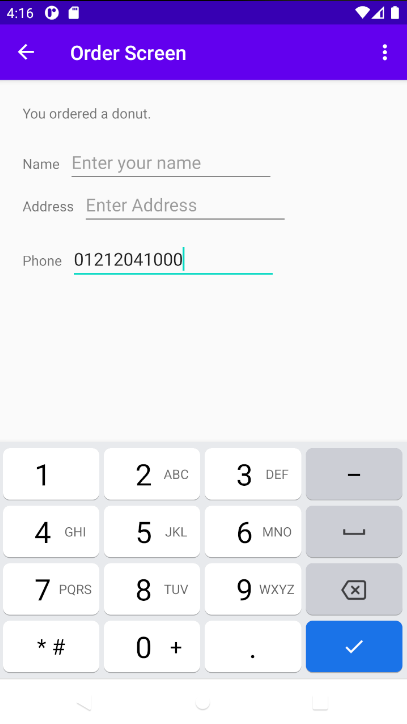
- To close the keyboard, tap the Done key tap the Done key .
To experiment with android:inputType attribute values, change an EditText element's android:inputType values to the following to see the result:
- textEmailAddress: Tapping the field brings up the email keyboard with the @ symbol located near the space key.
- textPassword: The characters the user enters turn into dots to conceal the entered password.
1.4 Combine input types in one EditText
You can combine inputType attribute values that don't conflict with each other. For example, you can combine the textMultiLine and textCapSentences attribute values for multiple lines of text in which each sentence starts with a capital letter.
- Open the fragment_order.xml layout file if it is not already open.
- Add a
TextViewunder thephone_labelelement already in the layout. Use the following attributes for the newTextView:Attribute
Value
android:id@+id/note_labelandroid:layout_widthwrap_contentandroid:layout_heightwrap_contentandroid:layout_marginStart24dpandroid:layout_marginLeft24dpandroid:layout_marginTop24dpandroid:textNoteapp:layout_constraintStart_toStartOfparentapp:layout_constraintTop_toBottomOf@+id/phone_label - Extract the string resource for the
android:textattribute value to create and entry for it callednote_label_textinstrings.xml. - Add an
EditTextelement. To use the visual layout editor, drag a Multiline Text element from the Palette pane to a position next to thenote_labelTextView. Then enter note_text for the ID field, and constrain the left side and baseline of the element to thenote_labelelement right side and baseline as you did previously with the otherEditTextelements. - Add a hint for text entry, such as Enter note, in the hint field in the Attributes pane.
- Click inside the
inputTypefield in the Attributes pane. ThetextMultiLinevalue is already selected. In addition, select textCapSentences to combine these attributes. - Check the XML code for the layout by clicking the Code tab. Extract the string resource for the
android:hintattribute value toenter_note_hint. The following attributes should be set for the newEditText(add thelayout_marginLeftattribute for compatibility with older versions of Android):
To combine values for the<EditText android:id="@+id/note_text" android:layout_width="wrap_content" android:layout_height="wrap_content" android:layout_marginStart="8dp" android:layout_marginLeft="8dp" android:ems="10" android:hint="@string/enter_note_hint" android:inputType="textMultiLine|textCapSentences" app:layout_constraintBaseline_toBaselineOf="@+id/note_label" app:layout_constraintStart_toEndOf="@+id/note_label" />android:inputTypeattribute, concatenate them using the pipe (|) character. - Run the app. Tap an image on the first screen, and then tap the floating action button to see the next
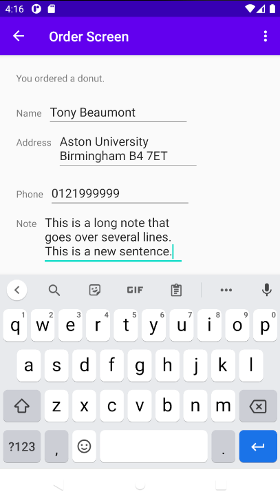
Fragment. - Tap inside the "Note" field enter complete sentences, as shown in the figure below. Use the Return key to create a new line, or simply type to wrap sentences over multiple lines.
Input controls are the interactive elements in your app's UI that accept data input. Radio buttons are input controls that are useful for selecting only one option from a set of options.
In this task you add a group of radio buttons to the DroidCafeInput app for setting the delivery options for the dessert order. For an overview and more sample code for radio buttons, see Radio Buttons.
2.1 Add a RadioGroup and radio buttons
To add radio buttons to OrderFragment in the DroidCafeInput app, you create RadioButton elements in the fragement_order.xml layout file. After editing the layout file, the layout for the radio buttons in OrderFragment will look something like the figure below.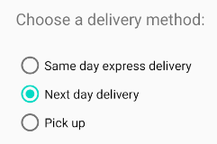
Because radio button selections are mutually exclusive, you group them together inside a RadioGroup. By grouping them together, the Android system ensures that only one radio button can be selected at a time.
- Open
fragment_order.xmland add aTextViewelement constrained to the bottom of thenote_textelement already in the layout, and to the left margin, as shown in the figure below.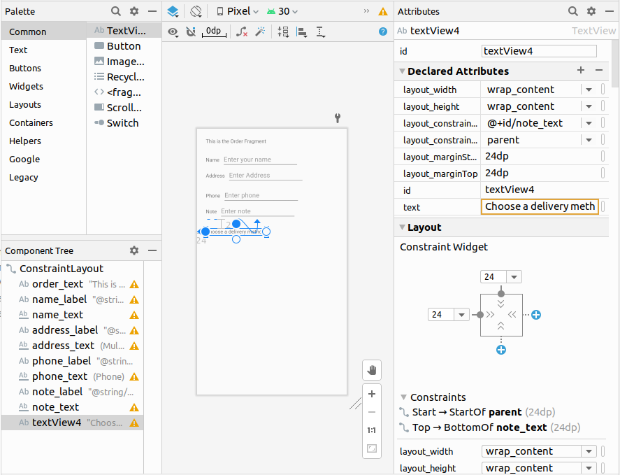
- Switch to editing XML, and make sure that you have the following attributes set for the new TextView:
Attribute
Value
android:id@+id/delivery_labelandroid:layout_widthwrap_contentandroid:layout_heightwrap_contentandroid:layout_marginStart24dpandroid:layout_marginLeft24dpandroid:layout_marginTop24dpandroid:textChoose a delivery method:android:textSize18spapp:layout_constraintStart_toStartOfparentapp:layout_constraintTop_toBottomOf@+id/note_text - Extract the string resource for
"Choose a delivery method:"to bechoose_delivery_method. - To add radio buttons, enclose them within a
RadioGroup. Add theRadioGroupto the layout underneath theTextViewyou just added, enclosing three RadioButton elements as shown in the XML code below:<RadioGroup android:layout_width="wrap_content" android:layout_height="wrap_content" android:layout_marginStart="24dp" android:layout_marginTop="24dp" android:orientation="vertical" app:layout_constraintStart_toStartOf="parent" app:layout_constraintTop_toBottomOf="@+id/delivery_label"> <RadioButton android:id="@+id/sameday" android:layout_width="wrap_content" android:layout_height="wrap_content" android:text="Same day express delivery" tools:layout_editor_absoluteX="30dp" tools:layout_editor_absoluteY="370dp" /> <RadioButton android:id="@+id/nextday" android:layout_width="wrap_content" android:layout_height="wrap_content" android:text="Next day delivery" tools:layout_editor_absoluteX="24dp" tools:layout_editor_absoluteY="351dp" /> <RadioButton android:id="@+id/pickup" android:layout_width="wrap_content" android:layout_height="wrap_content" android:text="Pick up" tools:layout_editor_absoluteX="28dp" tools:layout_editor_absoluteY="380dp" /> </RadioGroup> - Extract the three string resources for the
android:textattributes to the following names so that the strings can be translated easily:same_day_express_delivery,next_day_delivery, andpick_up.
2.2 Add the radio button click handler
- We will set up the click hander inside
OrderFragment. Add the following code to your onCreateView method in OrderFragment:RadioButton sameDay = v.findViewById(R.id.sameday); sameDay.setOnClickListener(new View.OnClickListener() { @Override public void onClick(View view) { boolean checked = ((RadioButton) view).isChecked(); if (checked) { displayToast(getString(R.string.same_day_express_delivery)); } } }); RadioButton nextDay = v.findViewById(R.id.nextday); nextDay.setOnClickListener(new View.OnClickListener() { @Override public void onClick(View view) { boolean checked = ((RadioButton) view).isChecked(); if (checked) { displayToast(getString(R.string.next_day_delivery)); } } }); RadioButton pickUp = v.findViewById(R.id.pickup); pickUp.setOnClickListener(new View.OnClickListener() { @Override public void onClick(View view) { boolean checked = ((RadioButton) view).isChecked(); if (checked) { displayToast(getString(R.string.pick_up)); } } }); - Add the displayToast method to your OrderFragment:
public void displayToast(String message) { Toast.makeText(getContext(), message, Toast.LENGTH_SHORT).show(); } - Run the app. Tap an image to see the
OrderFragmentscreen, which shows the delivery choices. Tap a delivery choice, and you see aToastmessage at the bottom of the screen with the choice, as shown in the figure below.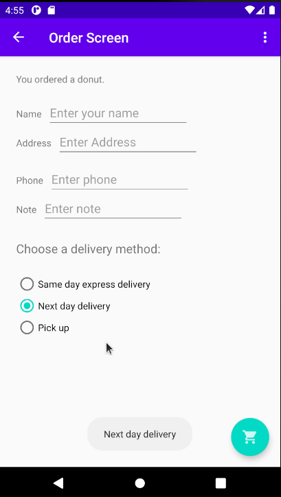
Challenge: The radio buttons for delivery choices in the DroidCafeInput app first appear unselected, which implies that there is no default delivery choice. Change the radio buttons so that one of them (such as nextday) is selected as the default when the radio buttons first appear.
A Spinner provides a quick way to select one value from a set. Touching the Spinner displays a drop-down list with all available values, from which the user can select one. If you are providing only two or three choices, you might want to use radio buttons for the choices if you have room in your layout for them; however, with more than three choices, a Spinner works very well, scrolls as needed to display items, and takes up little room in your layout.
To provide a way to select a label for a phone number (such as Home, Work, Mobile, or Other), you can add a spinner to the OrderFragment layout in the DroidCafe app to appear right next to the phone number field.
3.1 Add a spinner to the layout
To add a spinner to the OrderFragment layout in the DroidCafe app, follow these steps:
- Open fragment_order.xml in Design mode, click Containers in the Pallete options and drag Spinner from the Palette pane to the layout.
- Constrain the top of the
Spinnerelement to the bottom ofaddress_text, the right side to the right side of the layout, and the left side tophone_text. - To align the
Spinnerandphone_textelements horizontally, use the pack button in the toolbar, which provides options for packing or expanding selected UI elements.
 - Select both the
Spinnerandphone_textelements in the Component Tree, click the pack button, and choose Expand Horizontally. As a result, both theSpinnerandphone_textelements are set to fixed widths. - In the Attributes pane, set the Spinner ID to label_spinner, and set the top and right margins to 24, and the left margin to 8. Choose match_constraint for the
layout_widthdrop-down menu, and wrap_content for thelayout_heightdrop-down menu.
The layout should look like the figure below. The phone_text element's layout_width drop-down menu in the Attributes pane is set to 172dp. You can optionally experiment with other width settings.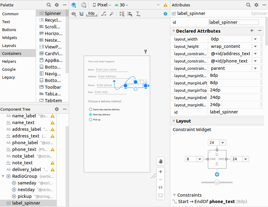
To look at the XML code for fragment_order.xml, click the Code tab.
The Spinner should have the following attributes:
	<Spinner
		android:id="@+id/label_spinner"
		android:layout_width="0dp"
		android:layout_height="wrap_content"
		android:layout_marginStart="8dp"
		android:layout_marginLeft="8dp"
		android:layout_marginTop="24dp"
		android:layout_marginEnd="24dp"
		android:layout_marginRight="24dp"
		app:layout_constraintEnd_toEndOf="parent"
		app:layout_constraintStart_toEndOf="@+id/phone_text"
		app:layout_constraintTop_toBottomOf="@+id/address_text" />
Be sure to add the android:layout_marginRight and android:layout_marginLeft attributes shown in the code snippet above to maintain compatibility with older versions of Android.
The phone_text element should now have the following attributes (after using the pack tool):
	<EditText
		android:id="@+id/phone_text"
		android:layout_width="172dp"
		android:layout_height="wrap_content"
		android:layout_marginStart="8dp"
		android:layout_marginLeft="8dp"
		android:ems="10"
		android:hint="@string/enter_phone_hint"
		android:inputType="phone"
		app:layout_constraintBaseline_toBaselineOf="@+id/phone_label"
		app:layout_constraintStart_toEndOf="@+id/phone_label" />
3.2 Add code to activate the Spinner and its listener
The choices for the Spinner are well-defined static strings such as "Home" and "Work," so you can use a text array defined in strings.xml to hold the values for it.
To activate the Spinner and its listener, implement the AdapterView.OnItemSelectedListener interface, which requires also adding the onItemSelected() and onNothingSelected() callback methods.
- Open
strings.xmland define the selectable values (Home, Work, Mobile, and Other) for theSpinneras the string arraylabels_array:
To define the selection callback for the<string-array name="labels_array"> <item>Home</item> <item>Work</item> <item>Mobile</item> <item>Other</item> </string-array>Spinner, change yourOrderFragmentclass to implement theAdapterView.OnItemSelectedListenerinterface as shown:
As you typepublic class OrderFragment extends Fragment implements AdapterView.OnItemSelectedListener {AdapterView. in the statement above, Android Studio automatically imports theAdapterViewwidget. The reason why you need theAdapterViewis because you need an adapter—specifically anArrayAdapter- to assign the array to theSpinner. An adapter connects your data - in this case, the array of spinner items - to theSpinner. You learn more about this pattern of using an adapter to connect data in another practical. This line should appear in your block of import statements:
After typing OnItemSelectedListener in the statement above, wait a few seconds for a red light bulb to appear in the left margin.import android.widget.AdapterView; - Click the light bulb and select Implement methods. The
onItemSelected()andonNothingSelected()methods, which are required forOnItemSelectedListener, should be highlighted, and the "Insert @Override" option should be selected. Click OK.
This step automatically adds emptyonItemSelected()andonNothingSelected()callback methods to the bottom of theOrderFragmentclass. Both methods use the parameterAdapterView<?>. The<?>is a Java type wildcard, enabling the method to be flexible enough to accept any type ofAdapterViewas an argument. - Instantiate a
Spinnerin theonCreateView()method using thelabel_spinnerelement in the layout, and set its listener (spinner.setOnItemSelectedListener) in theonCreateView()method, as shown in the following code snippet:@Override public View onCreateView(LayoutInflater inflater, ViewGroup container, Bundle savedInstanceState) { //setHasOptionsMenu(true); // Inflate the layout for this fragment View v = inflater.inflate(R.layout.fragment_order, container, false); // Create the spinner. Spinner spinner = v.findViewById(R.id.label_spinner); if (spinner != null) { spinner.setOnItemSelectedListener(this); } // Create ArrayAdapter using the string array and default spinner layout. - Continuing to edit the
onCreateView()method, add a statement that creates theArrayAdapterwith the string array (labels_array) using the Android-suppliedSpinnerlayout for each item (layout.simple_spinner_item):
The// Create ArrayAdapter using the string array and default spinner layout. ArrayAdapter<CharSequence> adapter = ArrayAdapter.createFromResource(getContext(), R.array.labels_array, android.R.layout.simple_spinner_item); // Specify the layout to use when the list of choices appears.simple_spinner_itemlayout used in this step, and thesimple_spinner_dropdown_itemlayout used in the next step, are the default predefined layouts provided by Android in theR.layoutclass. You should use these layouts unless you want to define your own layouts for the items in the Spinner and its appearance. - Specify the layout for the
Spinnerchoices to besimple_spinner_dropdown_item, and then apply the adapter to the Spinner:// Specify the layout to use when the list of choices appears. adapter.setDropDownViewResource (android.R.layout.simple_spinner_dropdown_item); // Apply the adapter to the spinner. if (spinner != null) { spinner.setAdapter(adapter); } // ... End of Spinner code ...
3.3 Add code to respond to Spinner selections
When the user selects an item in the Spinner, the Spinner receives an on-item-selected event. To handle this event, you already implemented the AdapterView.OnItemSelectedListener interface in the previous step, adding empty onItemSelected() and onNothingSelected() callback methods.
In this step you fill in the code for the onItemSelected() method to retrieve the selected item in the Spinner, using getItemAtPosition(), and assign the item to the spinnerLabel variable:
- Add code to the empty
onItemSelected()callback method, as shown below, to retrieve the user's selected item usinggetItemAtPosition(), and assign it tospinnerLabel. You can also add a call to thedisplayToast()method you already added toOrderFragment:
There is no need to add code to the emptypublic void onItemSelected(AdapterView<?> adapterView, View view, int i, long l) { spinnerLabel = adapterView.getItemAtPosition(i).toString(); displayToast(spinnerLabel); }onNothingSelected()callback method for this example. - Run the app.
TheSpinnerappears next to the phone entry field and shows the first choice (Home). Tapping the Spinner reveals all the choices, as shown in the figure below.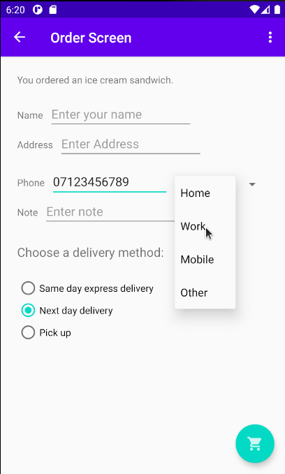
Tapping a choice in the Spinner shows a Toast message with the choice, as shown in the figure below.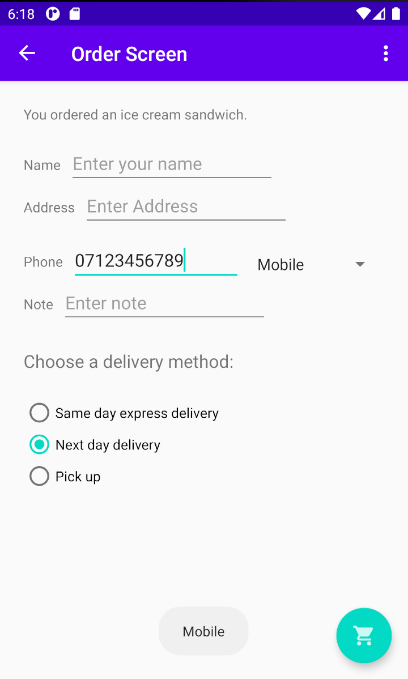
Challenge: Write code to perform an action directly from the keyboard by tapping a Send key, such as for dialing a phone number:
- Enter the phone number in the EditText field.
- Tap the Send key to launch the phone dialer. The dialer appears on the right side of the figure as shown below.
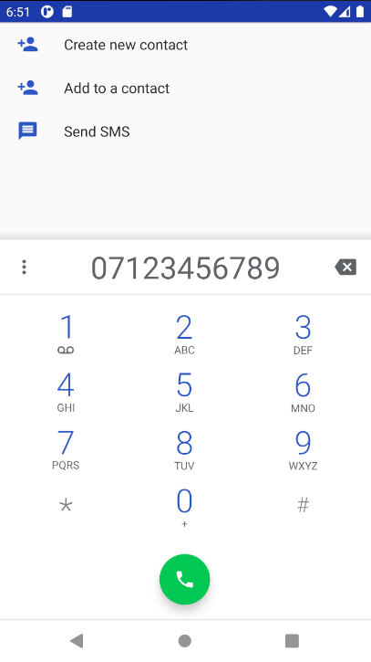
For this challenge, add theandroid:imeOptionsattribute to thephone_textEditText element with theactionSendvalue:
The user can now press the Send key to dial the phone number, as shown in the figure above.android:imeOptions="actionSend"
In the onCreate() method for this Activity, you can use setOnEditorActionListener() to set the listener for the EditText to detect if the key is pressed:
EditText editText = findViewById(R.id.editText_main);
// If view is found, set the listener for editText.
if (editText != null)
   editText.setOnEditorActionListener
                         (new TextView.OnEditorActionListener() {
      // Override onEditorAction method...
   });
For help setting the listener, see Specify the input method type.
The next step is to override onEditorAction() and use the IME_ACTION_SEND constant in the EditorInfo class to respond to the pressed key. In the example below, the key is used to call the dialNumber() method to dial the phone number:
@Override
public boolean onEditorAction(TextView textView, int actionId, KeyEvent keyEvent) {
   boolean handled = false;
   if (actionId == EditorInfo.IME_ACTION_SEND) {
      dialNumber(v);
      handled = true;
   }
   return handled;
}
To finish the challenge, create the dialNumber() method, which uses an implicit intent with ACTION_DIAL to pass the phone number to another app that can dial the number. It should look like this:
private void dialNumber() {
   // Find the editText_main view.
   EditText editText = v.findViewById(R.id.phone_text);
   String phoneNum = null;
   // If the editText field is not null,
   // concatenate "tel: " with the phone number string.
   if (editText != null) phoneNum = "tel:" +
                                      editText.getText().toString();
   // Optional: Log the concatenated phone number for dialing.
   Log.d(TAG, "dialNumber: " + phoneNum);
   // Specify the intent.
   Intent intent = new Intent(Intent.ACTION_DIAL);
   // Set the data for the intent as the phone number.
   intent.setData(Uri.parse(phoneNum));
   // If the intent resolves to a package (app),
   // start the activity with the intent.
   // note that the emulator will not be able to handle this intent
   if (intent.resolveActivity(getActivity().getPackageManager()) != null) {
      startActivity(intent);
   } else {
       Log.d("ImplicitIntents", "Can't handle this!");
   }
}
The following android:inputType attribute values affect the appearance of the on-screen keyboard:
textAutoCorrect: Suggest spelling corrections.textCapSentences: Start each new sentence with a capital letter.textPersonName: Show a single line of text with suggestions as the user types, and the Done key for the user to tap when they're finished.textMultiLine: Enable multiple lines of text entry and a Return key to add a new line.textPassword: Hide a password when entering it.textEmailAddress: Show an email keyboard rather than a standard keyboard.phone: Show a phone keypad rather than a standard keyboard.
You set values for theandroid:inputTypeattribute in the XML layout file for anEditTextelement To combine values, concatenate them using the pipe (|) character.
Radio buttons are input controls that are useful for selecting only one option from a set of options:
- Group
RadioButtonelements together inside aRadioGroupso that only oneRadioButtoncan be selected at a time. - The order in which you list the
RadioButtonelements in the group determines the order that they appear on the screen. - Use the
android:onClickattribute for eachRadioButtonto specify the click handler. Alternatively, specify theonClick()handler in theFragment'sonCreateViewmethod - To find out if a button is selected, use the
isChecked()method of the Checkable interface, which returnstrueif the button is selected.
ASpinnerprovides a drop-down menu: - Add a
Spinnerto the layout. - Use an
ArrayAdapterto assign an array of text values as theSpinnermenu items. - Implement the
AdapterView.OnItemSelectedListenerinterface, which requires also adding theonItemSelected()andonNothingSelected()callback methods to activate theSpinnerand its listener. - Use the
onItemSelected()callback method to retrieve the selected item in theSpinnermenu usinggetItemAtPosition().
The related concept documentation is in 4.2: Input controls.
Android Studio documentation:
Android developer documentation: