This practical codelab is part of Unit 1: of CS3040/DC3040. You will get the most value out of this course if you work through the codelabs in sequence:
For the complete list of codelabs in CS3040/DC3040, please see the Blackboard module.
For the Androidn training material this module is based on, including concept chapters, apps, and slides, see Android Developer Fundamentals (Version 2).
Note: This module uses the terms "codelab" and "practical" interchangeably.
Introduction
As you learned in Unit 1.2 Part A: Your first interactive UI, you can build a user interface (UI) using ConstraintLayout in the layout editor, which places UI elements in a layout using constraint connections to other elements and to the layout edges. ConstraintLayout was designed to make it easy to drag UI elements into the layout editor.
ConstraintLayout is a ViewGroup, which is a special View that can contain other View objects (called children or child views). This practical shows more features of ConstraintLayout and the layout editor.
This practical also introduces two other ViewGroup subclasses:
LinearLayout: A group that aligns child View elements within it horizontally or vertically.
RelativeLayout: A group of child View elements in which each View element is positioned and aligned relative to other View element within the ViewGroup. Positions of the child View elements are described in relation to each other or to the parent ViewGroup.
What you should already know
You should be able to:
- Create a Hello World app with Android Studio.
- Run an app on the emulator or a device.
- Create a simple layout for an app with ConstraintLayout.
- Extract and use string resources.
What you'll learn
- How to create a layout variant for horizontal (landscape) orientation.
- How to create a layout variant for tablets and larger displays.
- How to use a baseline constraint to align UI elements with text.
- How to use the pack and align buttons to align elements in the layout.
- How to position views within a LinearLayout.
- How to position views within a RelativeLayout.
What you'll do
- Create a layout variant for a horizontal display orientation.
- Create a layout variant for tablets and larger displays.
- Modify the layout to add constraints to the UI elements.
- Use
ConstraintLayoutbaseline constraints to align elements with text. - Use
ConstraintLayoutpack and align buttons to align elements. - Change the layout to use
LinearLayout. - Position elements in a
LinearLayout. - Change the layout to use
RelativeLayout. - Rearrange the views in the main layout to be relative to each other.
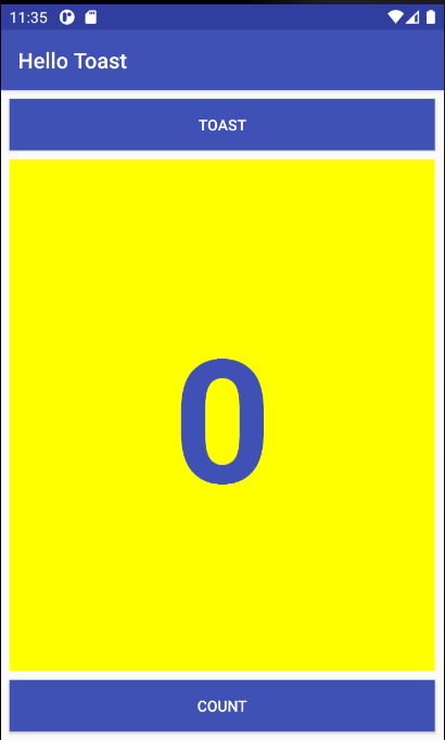
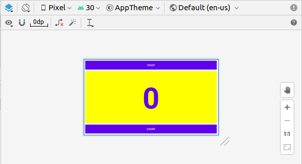
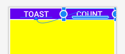
The Hello Toast app in a previous lesson uses ConstraintLayout to arrange the UI elements in the Activity layout, as shown in the figure below.
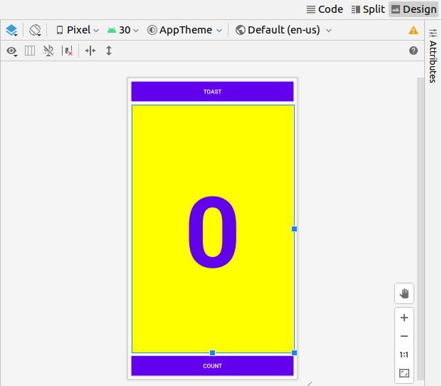
To gain more practice with ConstraintLayout, you will create a variant of this layout for horizontal orientation as shown in the figure below.
You will also learn how to use baseline constraints and some of the alignment features of ConstraintLayout by creating another layout variant for tablet displays.
You also learn about other ViewGroup subclasses such as LinearLayout and RelativeLayout, and change the Hello Toast app layout to use them.
In the previous lesson, the coding challenge required changing the layout of the Hello Toast app so that it would fit properly in a horizontal or vertical orientation. In this task you will learn an easier way to create variants of your layout for horizontal (also known as landscape) and vertical (also known as portrait) orientations for phones, and for larger displays such as tablets.
In this task you will use some of the buttons in the top two toolbars of the layout editor. The top toolbar lets you configure the appearance of the layout preview in the layout editor:
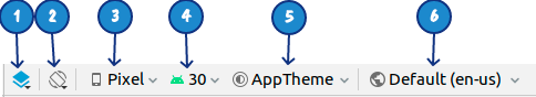
In the figure above:
- Select Design Surface: Select Design to display a color preview of your layout, or Blueprint to show only outlines for each UI element. To see both panes side by side, select Design + Blueprint.
- Orientation in Editor: Select Portrait or Landscape to show the preview in a vertical or horizontal orientation. This is useful for previewing the layout without having to run the app on an emulator or device. To create alternative layouts, select Create Landscape Variation or other variations.
- Device for Preview: Select the device type (phone/tablet, Android TV, or Android Wear).
- API Version in Editor: Select the version of Android to use to show the preview.
- Theme in Editor: Select a theme (such as AppTheme) to apply to the preview.
- Locale in Editor: Select the language and locale for the preview. This list displays only the languages available in the string resources (see the lesson on localization for details on how to add languages). You can also choose Preview as Right To Left to view the layout as if an RTL language had been chosen.
The second toolbar lets you configure the appearance of UI elements in a ConstraintLayout, and to zoom and pan the preview:
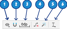
In the figure above:
- Show: Choose Show Constraints and Show Margins to show them in the preview, or to stop showing them.
- Autoconnect: Enable or disable Autoconnect. With Autoconnect enabled, you can drag any element (such as a Button) to any part of a layout to generate constraints against the parent layout.
- Default Margins: Set the default margins.
- Clear All Constraints: Clear all constraints in the entire layout.
- Infer Constraints: Create constraints by inference.
- Guidelines: Add vertical or horizontal guidelines.
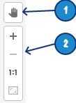
In the figure above:
- Pan control
- Zoom controls: Zoom in or out.
Tip: To learn more about using the layout editor, see Build a UI with Layout Editor. To learn more about how to build a layout with ConstraintLayout, see Build a Responsive UI with ConstraintLayout.
1.1 Preview the layout in a horizontal orientation
To preview the Hello Toast app layout with a horizontal orientation, follow these steps:
- Open the Hello Toast Layout app from the previous lesson which you can download from Blackboard.
- Open the activity_main.xml layout file. Click the Design tab if it is not already selected.
- Click the Orientation in Editor button
 in the top toolbar.
 - Select Switch to Landscape in the dropdown menu. The layout appears in horizontal orientation as shown below. To return to vertical orientation, select Switch to Portrait.
1.2 Create a layout variant for horizontal orientation
The visual difference between vertical and horizontal orientations for this layout is that the digit (0) in the show_countTextView element is too low for the horizontal orientation—too close to the Countbutton. Depending on which device or emulator you use, the TextView element may appear too large or not centered because the text size is fixed to 160sp.
To fix this for horizontal orientations while leaving vertical orientations alone, you can create variant of the Hello Toast app layout that is different for a horizontal orientation. Follow these steps:
- Click the Orientation in Editor button in the top toolbar.
- Choose Create Landscape Variation.
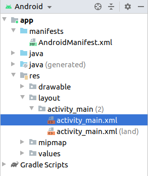
A new editor window opens with the land/activity_main.xml tab showing the layout for the landscape (horizontal) orientation. You can change this layout, which is specifically for horizontal orientation, without changing the original portrait (vertical) orientation. - In the Project > Android pane, look inside the res > layout directory, and you will see that Android Studio automatically created the variant for you, called
activity_main.xml (land).
1.3 Preview the layout for different devices
You can preview the layout for different devices without having to run the app on the device or emulator. Follow these steps:
- The land/activity_main.xml tab should still be open in the layout editor; if not, double-click the activity_main.xml (land) file in the layout directory.
- Click the Device for Preview button
 in the top toolbar.
 - Choose a different device in the dropdown menu. For example, choose Nexus 4, Nexus 5, and then Pixel to see differences in the previews. These differences are due to the fixed text size for the
TextView.
1.4 Change the layout for horizontal orientation
You can use the Attributes pane in the Design tab to set or change attributes, but it can sometimes be quicker to use the Code tab to edit the XML code directly. The Split tab shows the XML code and provides a Preview tab on the right side of the window to show the layout preview, as shown in the figure below.
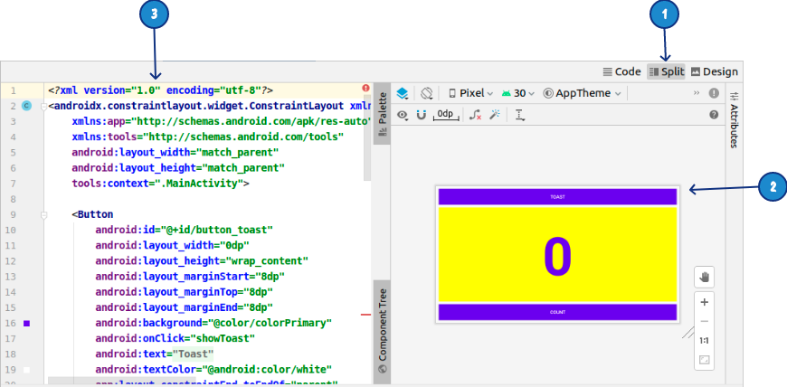
The figure above shows the following:
- The Split tab, which you use to show both code and preview panes
- The preview pane
- The XML code
You can try using the Device for Preview option to select different devices. I found that none of the pre-defined phone options gave a particularly bad layout, however if I install the app on my Samsung S5, the bottom of the zero character is off the screen in landscape mode. Even worse, if you choose a wearable option using Device for Preview, the Wear Square optiondoes not show any of the zero character.
To change the layout, follow these steps:
- The land/activity_main.xml tab should still be open in the layout editor; if not, double-click the activity_main.xml (land) file in the layout directory.
- Click the Split tab (if not already selected).
- Find the
TextViewelement in the XML code. - Change the
android:textSize="160sp"attribute toandroid:textSize="120sp". We don't need the app to display correctly on a wearable device, but if you have a phone with a small screen you want to choose theandroid:textSizevalue to be one that works with your device. You might need a smaller value that120sp. - Choose different devices in the Device in Editor dropdown menu to see how the layout looks on different devices in horizontal orientation.
In the editor pane, the land/activity_main.xml tab shows the layout for horizontal orientation. The activity_main.xml tab shows the unchanged layout for vertical orientation. You can switch back and forth by clicking the tabs. - Run the app on an emulator or device, and switch the orientation from vertical to horizontal to see both layouts. Once the zero character is completely visible in both portrait and landscape mode, you can move on. If the landscape mode still needs adjustment, go back to step 4 and change the value for
android:textSize.
1.5 Create a layout variant for tablets
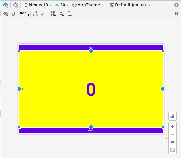
As you learned previously, you can preview the layout for different devices by clicking the Device in Editor button in the top toolbar. If you pick a device such as Nexus 10 (a tablet) from the menu, you can see that the layout is not ideal for a tablet screen—the text of each Button is too small, and the arrangement of the Button elements at the top and bottom is not ideal for a large-screen tablet.
To fix this for tablets while leaving the phone-size horizontal and vertical orientations alone, you can create variant of the layout that is completely different for tablets. Follow these steps:
- Click the Design tab (if not already selected) to show the design and blueprint panes.
- Click the Orientation in Editor button in the top toolbar.
- Choose Create Tablet Variation.
A new editor window opens with the sw600dp/activity_main.xml tab showing the layout for a tablet-sized device. The editor also picks a tablet device, such as the Nexus 9 or Nexus 10, for the preview. You can change this layout, which is specifically for tablets, without changing the other layouts.
1.6 Change the layout variant for tablets
You can use the Attributes pane in the Design tab to change attributes for this layout.
- Turn off the Autoconnect tool in the toolbar. For this step, ensure that the tool is disabled:

- Clear all constraints in the layout by clicking the Clear All Constraints
 button in the toolbar.
With constraints removed, you can move and resize the elements on the layout freely. - The layout editor offers resizing handles on all four corners of an element to resize it. In the Component Tree, select the
TextViewcalledshow_count. To get theTextViewout of the way so that you can freely drag theButtonelements, drag a corner of it to resize it, as shown in the animated figure below.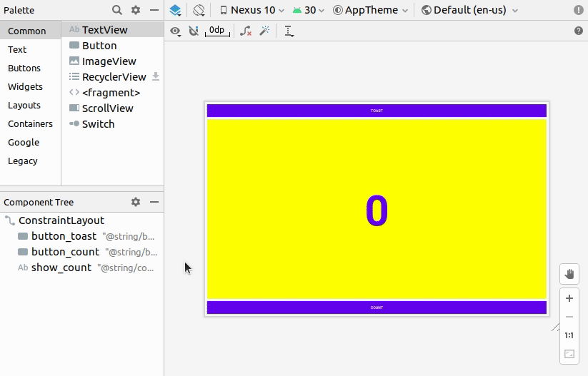
Resizing an element hardcodes the width and height dimensions. Avoid hardcoding the size dimensions for most elements, because you can't predict how hardcoded dimensions will look on screens of different sizes and densities. You are doing this now just to move the element out of the way, and you will change the dimensions in another step. - Select the
button_toastButtonin the Component Tree, click the Attributes tab to open the Attributes pane, and change thetextSizeto 60sp (#1 in the figure below) and thelayout_widthtowrap_content(#2 in the figure below).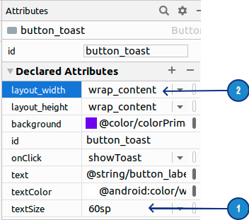
As shown on the figure below, you can click the view inspector's width control, which appears in two segments on the left and right sides of the square, until it shows Wrap Content. As an alternative, you can selectwrap_contentfrom thelayout_widthmenu.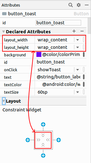
You usewrap_contentso that if theButtontext is localized into a different language, theButtonwill appear wider or thinner to accommodate the word in the different language. - Select the
button_countButtonin theComponent Tree, change thetextSizeto 60sp and thelayout_widthtowrap_content, and drag theButtonabove theTextViewto an empty space in the layout.
1.7 Use a baseline constraint
You can align one UI element that contains text, such as a TextView or Button, with another UI element that contains text. A baseline constraint lets you constrain the elements so that the text baselines match.
- Constrain the
button_toastButtonto the top and left side of the layout, drag thebutton_countButtonto a space near thebutton_toastButton, and constrain thebutton_countButtonto the right side of thebutton_toastButton, and assign borders of 8 around them, as shown in the animated figure: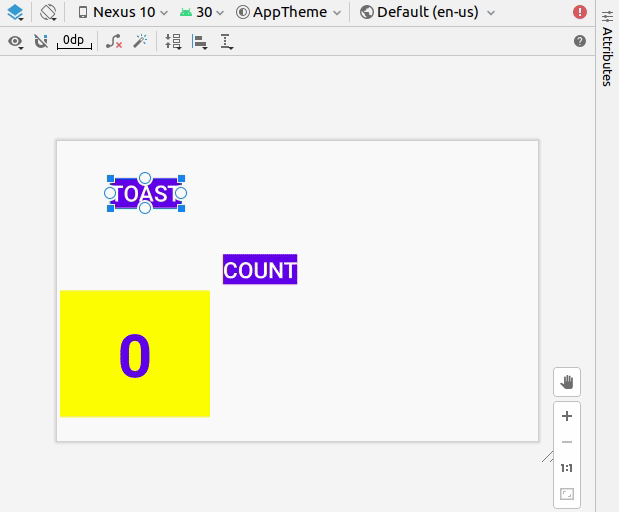
- Using a baseline constraint, you can constrain the
button_countButtonso that its text baseline matches the text baseline of thebutton_toastButton. Right-click thebutton_countelement, and choose Show Baseline from the menu. - Click the baseline of the
button_countButtonand drag a baseline constraint line to the baseline of thebutton_toastelement as shown below: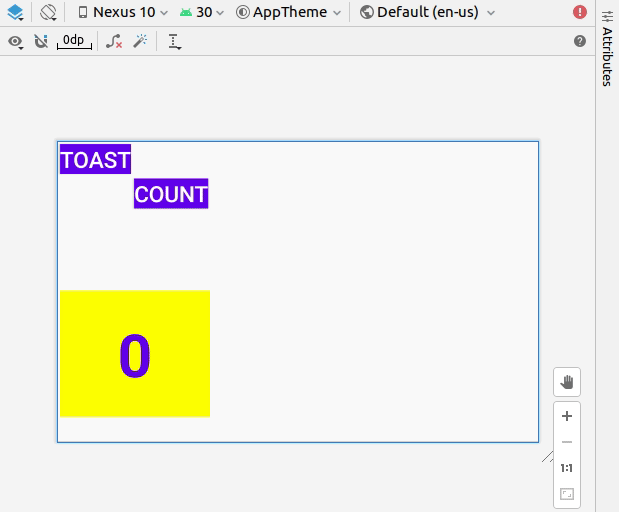
1.8 Expand the buttons horizontally
A chain is a group of views that are linked to each other with bi-directional position constraints. The views within a chain can be distributed either vertically or horizontally. You can read more about chains. We will create a chain containing the two buttons and then expand the buttons to fill the layout horizontally. The animated image below illustrates the steps.
- Drag a rectangle around the two Button views, right click and select Chains > Create Horizontal Chain
- Now click the
Buttonwith idbutton_toastand set itslayout_widthto 0dp (Match Constraints). - Click the
Buttonwith idbutton_countand set itslayout_widthto 0dp (Match Constraints).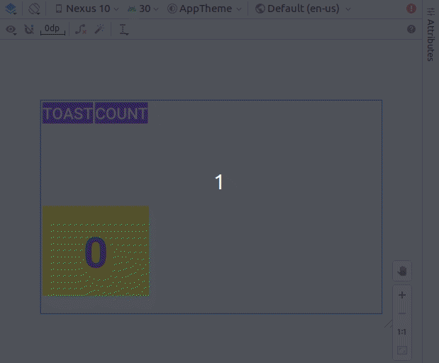
- To finish the layout, constraint the
show_countTextViewto the bottom of thebutton_toastButtonand to the sides and bottom of the layout, set itslayout_widthandlayout_heightto Match Constraints and set its margins to 8, as shown in the animated figure below.
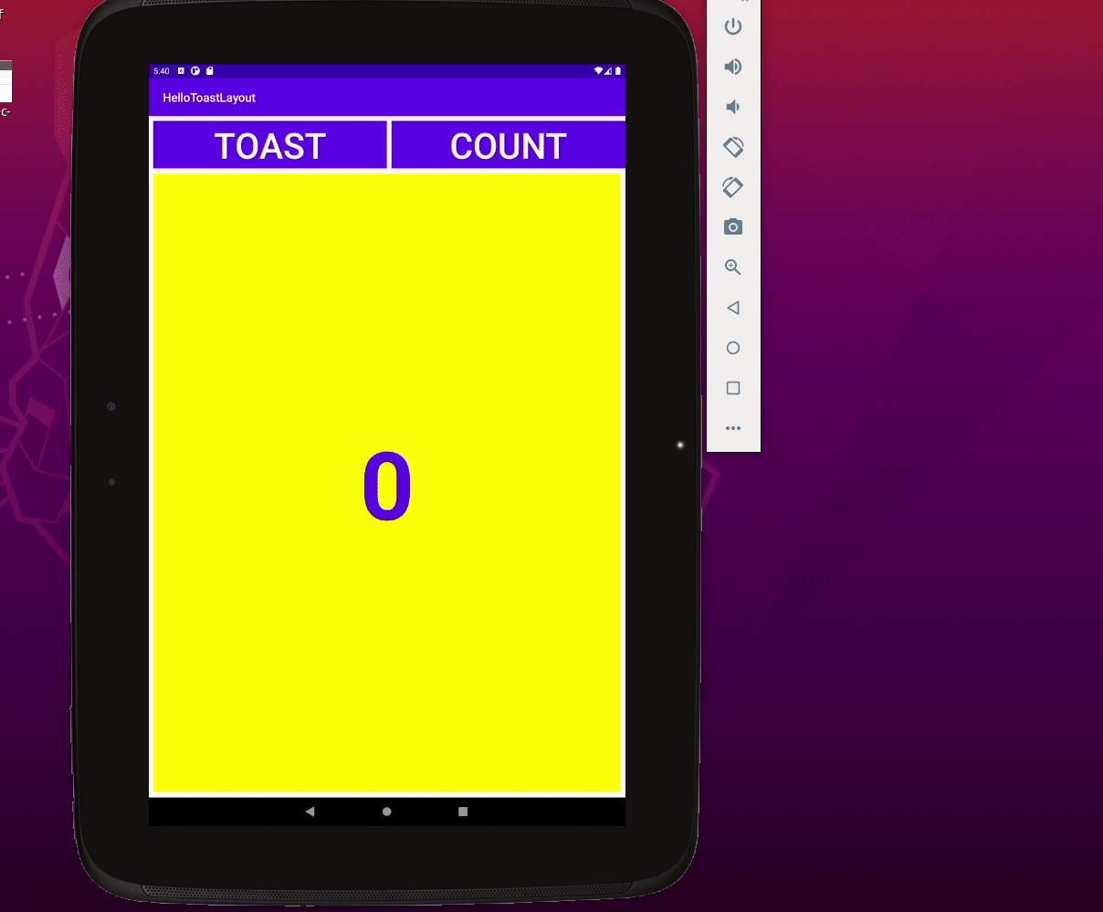
- Click the Orientation in Editor button in the top toolbar and choose Switch to Portrait. The tablet layout appears in vertical orientation. You can choose Switch to Landscape to return to vertical orientation. The layout should look the same in both orientations. Here is a screenshot of the app running in a Tablet (Nexus 10) emulator:
- Run the app on different emulators, and change the orientation after running the app, to see how it looks on different types of devices. You have successfully created an app that can run with a proper UI on phones and tablets that have different screen sizes and densities.
Tip: For more information on using ConstraintLayout, see Build a Responsive UI with ConstraintLayout.
You can find the completed code for this part of this codelab on Blackboard.
Challenge: Explore the different options for Horizontal Chain Style (right-click the chain of buttons and select Chains > Horizontal Chain Style. This option goes hand in hand with the layout_width of each Button.
Try and create the following set of variations of the button layouts, the first of which we already did in the exercise above.
Hint: You only need to change the settings for layout_width and chain style.
LinearLayout is a ViewGroup that arranges its collection of views in a horizontal or vertical row. A LinearLayout is one of the most common layouts because it is simple and fast. It is often used within another view group to arrange UI elements horizontally or vertically.
A LinearLayout is required to have these attributes:
layout_widthlayout_heightorientation
The layout_width and layout_height can take one of these values:
match_parent: Expands the view to fill its parent by width or height. When the LinearLayout is the root view, it expands to the size of the screen (the parent view).wrap_content: Shrinks the view dimensions so the view is just big enough to enclose its content. If there is no content, the view becomes invisible.- Fixed number of
dp(density-independent pixels): Specify a fixed size, adjusted for the screen density of the device. For example,16dpmeans 16 density-independent pixels.
Theorientationcan be: horizontal: Views are arranged from left to right.vertical: Views are arranged from top to bottom.
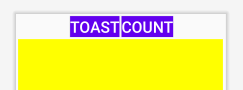
In this task you will change the ConstraintLayout root view group for the Hello Toast app to LinearLayout so that you can gain practice in using LinearLayout.
2.1 Change the root view group to LinearLayout
- Open the Hello Toast app from the previous task.
- Open the
activity_main.xmllayout file (if it is not already open), and click the Code tab at the top right of the editing pane to see the XML code. At the very top of the XML code is the following tag line:<androidx.constraintlayout.widget.ConstraintLayout xmlns:android="http://schemas.android.com/apk/res/android" xmlns:app="http://schemas.android.com/apk/res-auto" xmlns:tools="http://schemas.android.com/tools" android:layout_width="match_parent" android:layout_height="match_parent" tools:context=".MainActivity"> - Change the
androidx.constraintlayout.widget.ConstraintLayouttag name to beLinearLayoutso that the code looks like this:<LinearLayout xmlns:android="http://schemas.android.com/apk/res/android" xmlns:app="http://schemas.android.com/apk/res-auto" xmlns:tools="http://schemas.android.com/tools" android:layout_width="match_parent" android:layout_height="match_parent" tools:context=".MainActivity"> - Make sure the closing tag at the end of the code has changed to
</LinearLayout>(Android Studio automatically changes the closing tag if you change the opening tag). If it hasn't changed automatically, change it manually. - Under the
<LinearLayouttag line, add the following attribute after theandroid:layout_heightattribute:android:orientation="vertical" - After making these changes, some of the XML attributes for other elements are underlined in red because they are used with
ConstraintLayoutand are not relevant forLinearLayout.
2.2 Change element attributes for the LinearLayout
Follow these steps to change UI element attributes so that they work with LinearLayout:
- Continue editing the
activity_main.xmllayout file (if it is not already open), and click the Code tab to view the XML. - Find the
button_toastButtonelement, and change the following attribute:Original
Change to
android:layout_width="0dp"android:layout_width="match_parent" - Delete the following attributes from the
button_toastelement:app:layout_constraintEnd_toEndOf="parent" app:layout_constraintStart_toStartOf="parent" app:layout_constraintTop_toTopOf="parent" - Find the
button_countButton element, and change the following attribute:Original
Change to
android:layout_width="0dp"android:layout_width="match_parent" - Delete the following attributes from the
button_countelement:app:layout_constraintBottom_toBottomOf="parent" app:layout_constraintEnd_toEndOf="parent" app:layout_constraintStart_toStartOf="parent" - Find the
TextViewelementshow_countcalled , and change the following attributes:Original
Change to
android:layout_width="0dp"android:layout_width="match_parent"android:layout_height="0dp"android:layout_height="wrap_content" - Delete the following attributes from the
show_countelement:
Click the Design tab on the top right of the editor window to see a preview of the layout thus far:app:layout_constraintBottom_toTopOf="@+id/button_count" app:layout_constraintEnd_toEndOf="parent" app:layout_constraintStart_toStartOf="parent" app:layout_constraintTop_toBottomOf="@+id/button_toast"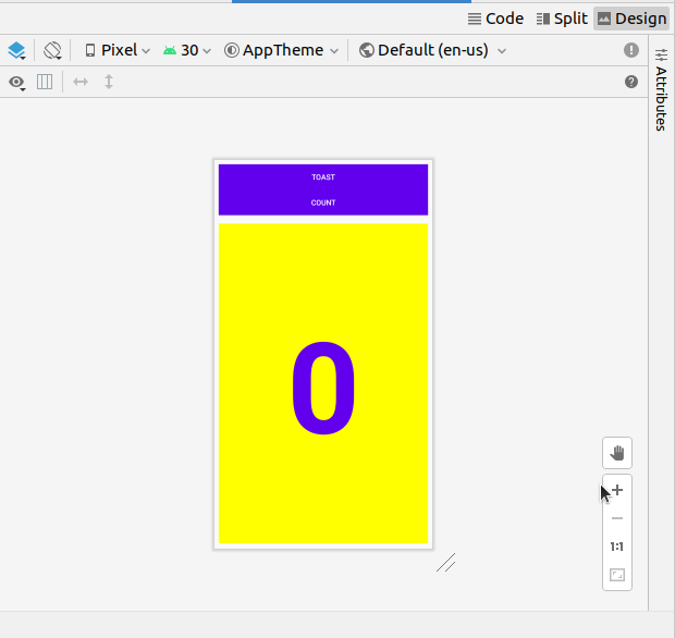
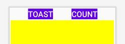
2.3 Change the positions of elements in the LinearLayout
LinearLayout arranges its elements in a horizontal or vertical row. You have already added the android:orientation="vertical" attribute for the LinearLayout, so the elements are stacked on top of each other vertically as shown in the previous figure.
To change their positions so that the Count button is on the bottom, follow these steps:
- Continue editing the
activity_main.xmllayout file and click the Code tab to view the XML. - Select the
button_countButton and all of its attributes, from the<Buttontag up to and including the closing/>tag, and choose Edit > Cut. - Click after the closing
/>tag of theTextViewelement but before the closing</LinearLayout>tag, and choose Edit > Paste. - (Optional) To fix any indents or spacing issues for cosmetic purposes, choose Code > Reformat Code to reformat the XML code with proper spacing and indents.
The XML code for the UI elements now looks like the following:<?xml version="1.0" encoding="utf-8"?> <LinearLayout xmlns:android="http://schemas.android.com/apk/res/android" xmlns:app="http://schemas.android.com/apk/res-auto" xmlns:tools="http://schemas.android.com/tools" android:layout_width="match_parent" android:layout_height="match_parent" android:orientation="vertical" tools:context=".MainActivity"> <Button android:id="@+id/button_toast" android:layout_width="match_parent" android:layout_height="wrap_content" android:layout_marginStart="8dp" android:layout_marginTop="8dp" android:layout_marginEnd="8dp" android:background="@color/colorPrimary" android:onClick="showToast" android:text="@string/button_label_toast" android:textColor="@android:color/white" /> <TextView android:id="@+id/show_count" android:layout_width="match_parent" android:layout_height="wrap_content" android:layout_marginStart="8dp" android:layout_marginTop="8dp" android:layout_marginEnd="8dp" android:layout_marginBottom="8dp" android:background="#FFFF00" android:gravity="center_vertical" android:text="@string/count_initial_value" android:textAlignment="center" android:textColor="@color/colorPrimary" android:textSize="240sp" android:textStyle="bold" /> <Button android:id="@+id/button_count" android:layout_width="match_parent" android:layout_height="wrap_content" android:layout_marginStart="8dp" android:layout_marginEnd="8dp" android:layout_marginBottom="8dp" android:background="@color/colorPrimary" android:onClick="countUp" android:text="@string/button_label_count" android:textColor="@android:color/white" /> </LinearLayout>
By moving the button_countButton below the TextView, the layout is now close to what you had before, with the Countbutton on the bottom. The preview of the layout now looks like the following:
2.4 Add weight to the TextView element
Specifying gravity and weight attributes gives you additional control over arranging views and content in a LinearLayout.
The android:gravityattribute specifies the alignment of the content of a View within the View itself. In the previous lesson you set this attribute for the show_countTextView in order to center the content (the digit 0) in the middle of the TextView:
android:gravity="center_vertical"
The android:layout_weight attribute indicates how much of the extra space in the LinearLayout will be allocated to the View. If only one View has this attribute, it gets all the extra screen space. For multiple View elements, the space is prorated. For example, if the Button elements each have a weight of 1 and the TextView2, totaling 4, the Button elements get one quarter of the space each, and the TextView gets the remaining half.
On different devices, the layout may show the show_countTextView element as filling part or most of the space between the Toast and Count buttons. In order to expand the TextView to fill the available space no matter which device is used, specify the android:gravity attribute for the TextView. Follow these steps:
- Continue editing the
activity_main.xmllayout file, and click the Code tab to view the XML. - Find the
show_countTextViewelement, and add the following attribute:android:layout_weight="1" - The preview now looks like the following figure.
The show_countTextView element takes up all the space between the buttons. You can preview the layout for different devices, as you did in a previous task by clicking the Device in Editor button as you did in a previous task by clicking the Device in Editor button in the top toolbar of the preview pane, and choosing a different device. No matter which device you choose for the preview, the show_countTextView element should take up all the space between the buttons.
Task 2 solution code
The XML code in activity_main.xml:
<?xml version="1.0" encoding="utf-8"?>
<LinearLayout xmlns:android="http://schemas.android.com/apk/res/android"
	xmlns:app="http://schemas.android.com/apk/res-auto"
	xmlns:tools="http://schemas.android.com/tools"
	android:layout_width="match_parent"
	android:layout_height="match_parent"
	android:orientation="vertical"
	tools:context=".MainActivity">

	<Button
		android:id="@+id/button_toast"
		android:layout_width="match_parent"
		android:layout_height="wrap_content"
		android:layout_marginStart="8dp"
		android:layout_marginTop="8dp"
		android:layout_marginEnd="8dp"
		android:background="@color/colorPrimary"
		android:onClick="showToast"
		android:text="@string/button_label_toast"
		android:textColor="@android:color/white" />


	<TextView
		android:id="@+id/show_count"
		android:layout_width="match_parent"
		android:layout_height="wrap_content"
		android:layout_marginStart="8dp"
		android:layout_marginTop="8dp"
		android:layout_marginEnd="8dp"
		android:layout_marginBottom="8dp"
		android:background="#FFFF00"
		android:gravity="center_vertical"
		android:layout_weight="1"
		android:text="@string/count_initial_value"
		android:textAlignment="center"
		android:textColor="@color/colorPrimary"
		android:textSize="240sp"
		android:textStyle="bold" />

	<Button
		android:id="@+id/button_count"
		android:layout_width="match_parent"
		android:layout_height="wrap_content"
		android:layout_marginStart="8dp"
		android:layout_marginEnd="8dp"
		android:layout_marginBottom="8dp"
		android:background="@color/colorPrimary"
		android:onClick="countUp"
		android:text="@string/button_label_count"
		android:textColor="@android:color/white" />

</LinearLayout>
A RelativeLayout is a view grouping in which each view is positioned and aligned relative to other views within the group. In this task you will learn how to build a layout with RelativeLayout.
3.1 Change LinearLayout to RelativeLayout
An easy way to change the LinearLayout to a RelativeLayout is to add XML attributes in the Text tab.
- Open the
activity_main.xmllayout file, and click the Code tab at the top right of the editing pane to see the XML code. - Change the
<LinearLayoutat the top to<RelativeLayoutso that the statement looks like this:<RelativeLayout xmlns:android="http://schemas.android.com/apk/res/android" - Scroll down to make sure that the ending tag
</LinearLayout>has automatically been changed to</RelativeLayout>and if it hasn't, change it manually.
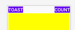
3.2 Rearrange views in a RelativeLayout
An easy way to rearrange and position views in a RelativeLayout is to add XML attributes in the Text tab.
- Click the Design tab at the top right of the editor to see the layout preview, which now looks like the figure below.
With the change to RelativeLayout, the layout editor also changed some of the view attributes. For example: - The Count
Button(button_count) overlays the ToastButton, which is why you can't see the ToastButton(button_toast). - The top part of the
TextView(show_count) overlays theButtonelements. - Add the
android:layout_belowattribute to thebutton_countButton to position theButtondirectly below theshow_countTextView. This attribute is one of several attributes for positioning views within aRelativeLayout- you place views in relation to other views.android:layout_below="@+id/show_count" - Add the
android:layout_centerHorizontalattribute to the sameButtonto center the view horizontally within its parent, which in this case is theRelativeLayoutview group.
The full XML code for theandroid:layout_centerHorizontal="true"button_countButton is as follows:<Button android:id="@+id/button_count" android:layout_width="match_parent" android:layout_height="wrap_content" android:layout_below="@+id/show_count" android:layout_centerHorizontal="true" android:layout_marginStart="8dp" android:layout_marginEnd="8dp" android:layout_marginBottom="8dp" android:background="@color/colorPrimary" android:onClick="countUp" android:text="@string/button_label_count" android:textColor="@android:color/white" /> - Add the following attributes to the
show_countTextView:
Theandroid:layout_below="@+id/button_toast" android:layout_alignParentLeft="true" android:layout_alignParentStart="true"android:layout_alignParentLeftattribute aligns the view to the left side of theRelativeLayoutparent view group. While this attribute by itself is enough to align the view to the left side, you may want the view to align to the right side if the app is running on a device that is using a right-to-left language. Thus, theandroid:layout_alignParentStartattribute makes the "start" edge of this view match the start edge of the parent. The start is the left edge of the screen if the preference is left-to-right, or it is the right edge of the screen if the preference is right-to-left. - Delete the
android:layout_weight="1"attribute from theshow_countTextView, which is not relevant for aRelativeLayout. The layout preview now looks like the following figure: Tip:
Tip: RelativeLayoutmakes it relatively easy to quickly place UI elements in a layout. To learn more about how to position views in aRelativeLayout, see "Positioning Views" in the "Relative Layout" topic of the API Guide.
Task 3 solution code
The XML code in activity_main.xml:
<?xml version="1.0" encoding="utf-8"?>
<RelativeLayout xmlns:android="http://schemas.android.com/apk/res/android"
xmlns:app="http://schemas.android.com/apk/res-auto"
xmlns:tools="http://schemas.android.com/tools"
android:layout_width="match_parent"
android:layout_height="match_parent"
android:orientation="vertical"
tools:context=".MainActivity">
<Button
android:id="@+id/button_toast"
android:layout_width="match_parent"
android:layout_height="wrap_content"
android:layout_marginStart="8dp"
android:layout_marginTop="8dp"
android:layout_marginEnd="8dp"
android:background="@color/colorPrimary"
android:onClick="showToast"
android:text="@string/button_label_toast"
android:textColor="@android:color/white" />
<TextView
android:id="@+id/show_count"
android:layout_width="match_parent"
android:layout_height="wrap_content"
android:layout_below="@+id/button_toast"
android:layout_alignParentLeft="true"
android:layout_alignParentStart="true"
android:layout_marginStart="8dp"
android:layout_marginTop="8dp"
android:layout_marginEnd="8dp"
android:layout_marginBottom="8dp"
android:layout_weight="1"
android:background="#FFFF00"
android:gravity="center_vertical"
android:text="@string/count_initial_value"
android:textAlignment="center"
android:textColor="@color/colorPrimary"
android:textSize="240sp"
android:textStyle="bold" />
	<Button
		android:id="@+id/button_count"
		android:layout_width="match_parent"
		android:layout_height="wrap_content"
		android:layout_below="@+id/show_count"
		android:layout_centerHorizontal="true"
		android:layout_marginStart="8dp"
		android:layout_marginEnd="8dp"
		android:layout_marginBottom="8dp"
		android:background="@color/colorPrimary"
		android:onClick="countUp"
		android:text="@string/button_label_count"
		android:textColor="@android:color/white" />
</RelativeLayout>
Using the layout editor to preview and create variants:
- To preview the app layout with a horizontal orientation in the layout editor, click the Orientation in Editor button in the top toolbar and choose Switch to Landscape. Choose Switch to Portrait to return to vertical orientation.
- To create a variant of the layout that is different for a horizontal orientation, click the Orientation in Editor button and choose Create Landscape Variation. A new editor window opens with the
land/activity_main.xmltab showing the layout for the landscape (horizontal) orientation. - To preview the layout for different devices without having to run the app on the device or emulator, click the Device in Editor button click the Device in Editor button in the top toolbar, and choose a device.
- To create variant of the layout that is different for a tablet (larger screen), click the Orientation in Editor button and choose Create Tablet Variation. A new editor window opens with the sw600dp/activity_main.xml tab showing the layout for a tablet-sized device.
Using ConstraintLayout:
- To clear all constraints in a layout with the
ConstraintLayoutroot, click the Clear All Constraints button in the toolbar. - You can align one UI element that contains text, such as a
TextVieworButton, with another UI element that contains text. A baseline constraint lets you constrain the elements so that the text baselines match. - To create a baseline constraint, right-click on the UI element and choose Show baseline, then click and drag a baseline constraint line to the baseline of the other element.
- Buttons can be grouped in a horizontal or vertical chain. To create a chain of views, you select all of the views that you want to include in the chain, and select Create Horizontal Chain or Create Vertival Chain. The layout of the views in the chain then depends on the chain style (spread, spread inside, or packed) and the
layout_width/layout_heightof each view.
Using LinearLayout:
- LinearLayout is a ViewGroup that arranges its collection of views in a horizontal or vertical row.
- A
LinearLayoutis required to have thelayout_width,layout_height, andorientationattributes. match_parentforlayout_widthorlayout_height: Expands theViewto fill its parent by width or height. When theLinearLayoutis the rootView, it expands to the size of the screen (the parentView).wrap_contentforlayout_widthorlayout_height: Shrinks the dimensions so theViewis just big enough to enclose its content. If there is no content, theViewbecomes invisible.- Fixed number of
dp(density-independent pixels) forlayout_widthorlayout_height: Specify a fixed size, adjusted for the screen density of the device. For example, 16dp means 16 density-independent pixels.
Theorientationfor aLinearLayoutcan behorizontalto arrange elements from left to right, orverticalto arrange elements from top to bottom. - Specifying
gravityandweightattributes gives you additional control over arranging views and content in aLinearLayout. - The
android:gravityattribute specifies the alignment of the content of aViewwithin theViewitself. - The
android:layout_weightattribute indicates how much of the extra space in theLinearLayoutwill be allocated to theView. If only oneViewhas this attribute, it gets all the extra screen space. For multipleViewelements, the space is prorated. For example, if twoButtonelements each have a weight of 1 and aTextView2, totaling 4, theButtonelements get one quarter of the space each, and theTextViewgets half.
Using RelativeLayout:
- A RelativeLayout is a
ViewGroupin which each view is positioned and aligned relative to other views within the group. - Use
android:layout_alignParentTopto align theViewto the top of the parent. - Use
android:layout_alignParentLeftto align theViewto the left side of the parent. - Use
android:layout_alignParentStartto make the start edge of theViewmatch the start edge of the parent. This attribute is useful if you want your app to work on devices that use different language or locale preferences. The start is the left edge of the screen if the preference is left-to-right, or it is the right edge of the screen if the preference is right-to-left.
The related concept documentation is in 1.2: Layouts and resources for the UI.
Android Studio documentation:
Android developer documentation:
- Layouts
- Build a UI with Layout Editor
- Build a Responsive UI with ConstraintLayout
- LinearLayout
- RelativeLayout
- View
- Button
- TextView
- Supporting different pixel densities
Other:
- There is a Codelab on Blackboard: Using
ConstraintLayoutto design your Android views - Vocabulary words and concepts glossary