The user interface (UI) that appears on a screen of an Android device
consists of a hierarchy of objects called views — every element of the
screen is a View. The View class represents the basic building block
for all UI components, and the base class for classes that provide
interactive UI components such as buttons, checkboxes, and text entry
fields. Commonly used View subclasses described over several lessons
include:
TextView for displaying text.- EditText to enable the user to enter and edit text.
- Button and other clickable elements (such as RadioButton, CheckBox, and Spinner) to provide interactive behavior.
- ScrollView and RecyclerView to display scrollable items.
- ImageView for displaying images.
- ConstraintLayout
and
LinearLayout
for containing otherViewelements and positioning them.
The Java code that displays and drives the UI is contained in a class that extends Activity. An Activity is usually associated with a layout of UI views defined as an XML (eXtended Markup Language) file. This XML file is usually named after its Activity and defines the layout of View elements on the screen.
For example, the MainActivity code in the Hello World app displays a layout defined in the activity_main.xml layout file, which includes a TextView with the text "Hello World".
In more complex apps, an Activity might implement actions to respond to user taps, draw graphical content, or request data from a database or the internet. You learn more about the Activity class in another lesson.
In this practical you learn how to create your first interactive app—an app that enables user interaction. You create an app using the Empty Activity template. You also learn how to use the layout editor to design a layout, and how to edit the layout in XML. You need to develop these skills so you can complete the other practicals in this course.
What you should already know
You should be familiar with:
- How to install and open Android Studio.
- How to create the HelloWorld app.
- How to run the HelloWorld app.
What you'll learn
- How to create an app with interactive behavior.
- How to use the layout editor to design a layout.
- How to edit the layout in XML.
- A lot of new terminology. Check out the Vocabulary words and concepts glossary for friendly definitions.
What you'll do
- Create an app and add two Button elements and a TextView to the layout.
- Manipulate each element in the ConstraintLayout to constrain them to the margins and other elements.
- Change UI element attributes.
- Edit the app's layout in XML.
- Extract hardcoded strings into string resources.
- Implement click-handler methods to display messages on the screen when the user taps each Button.
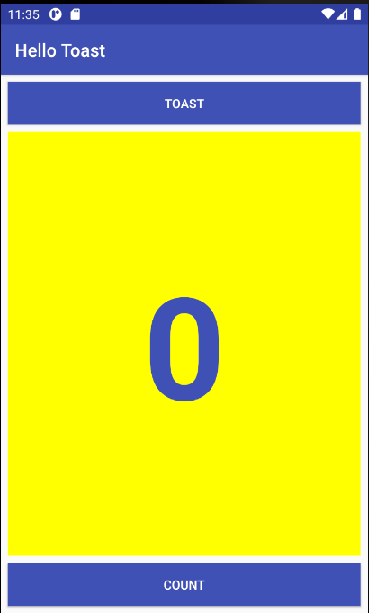
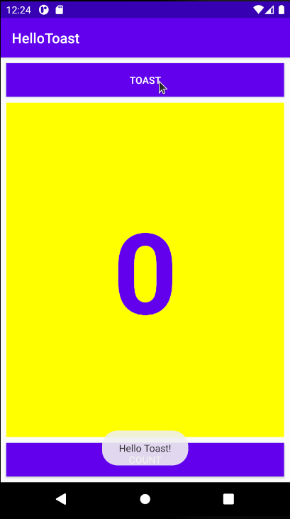
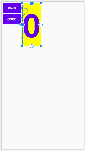
The HelloToast app consists of two Button elements and one TextView. When the user taps the first Button, it displays a short message (a Toast) on the screen. Tapping the second Button increases a "click" counter displayed in the TextView, which starts at zero.
Here's what the finished app looks like:
In this practical, you design and implement a project for the HelloToast app. A link to the solution code is provided at the end.
1.1 Create the Android Studio project
- Start Android Studio and create a new project with the following parameters:
Attribute
Value
Template
Empty Activity (Click Next)
Application Name
Hello Toast
Package Name
uk.aston.hellotoast (or your own domain)
Language
Java
Minimum SDK
API18: Android 4.3 (Jelly Bean)
- Select Run > Run app or click the
 in the toolbar to build and execute the app on the emulator or your device.)
1.2 Explore the layout editor
Android Studio provides the layout editor for quickly building an app's layout of user interface (UI) elements. It lets you drag elements to a visual design and blueprint view, position them in the layout, add constraints, and set attributes. Constraints determine the position of a UI element within the layout. A constraint represents a connection or alignment to another view, the parent layout, or an invisible guideline.
Explore the layout editor, and refer to the figure below as you follow the numbered steps:
- In the app > res > layout folder in the Project > Android pane, double-click the activity_main.xml file to open it, if it is not already open.
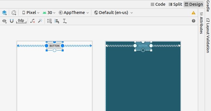
- Click the Design tab if it is not already selected. You use the Design tab to manipulate elements and the layout, and the Code tab to edit the XML code for the layout. The Split tab shows both XML code and design.
- The Palettes pane shows UI elements that you can use in your app's layout.
- The Component tree pane shows the view hierarchy of UI elements.
Viewelements are organized into a tree hierarchy of parents and children, in which a child inherits the attributes of its parent. In the figure above, theTextViewis a child of the ConstraintLayout. You will learn about these elements later in this lesson. - The design and blueprint panes of the layout editor showing the UI elements in the layout. In the figure above, the layout shows only one element: a
TextViewthat displays "Hello World". - The Attributes tab displays the Attributes pane for setting properties for a UI element.
Tip: See Building a UI with Layout Editor for details on using the layout editor, and Meet Android Studio for the full Android Studio documentation.
In this task you create the UI layout for the HelloToast app in the layout editor using the ConstraintLayout features. You can create the constraints manually, as shown later, or automatically using the Autoconnect tool.
2.1 Examine the element constraints
Follow these steps:
- Open
activity_main.xmlfrom the Project > Android pane if it is not already open. If the Design tab is not already selected, click it.
If there is no blueprint, click the Select Design Surface button in the toolbar and choose Design + Blueprint.
 - The Autoconnect tool
 is also located in the toolbar. It is enabled by default. For this step, ensure that the tool is not disabled.
 - Click the zoom in
 button to zoom into the design and blueprint panes for a close-up look.
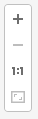
 - Select TextView in the Component Tree pane. The "Hello World"
TextViewis highlighted in the design and blueprint panes and the constraints for the element are visible. - Refer to the animated figure below for this step. Click the circular handle on the right side of the
TextViewto delete the horizontal constraint that binds the view to the right side of the layout. TheTextViewjumps to the left side because it is no longer constrained to the right side. To add back the horizontal constraint, click the same handle and drag a line to the right side of the layout.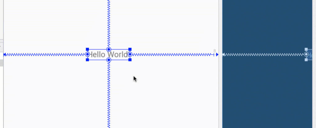
In the blueprint or design panes, the following handles appear on the TextView element:
- Constraint handle: To create a constraint as shown in the animated figure above, click a constraint handle, shown as a circle on the side of an element. Then drag the handle to another constraint handle, or to a parent boundary. A zigzag line represents the constraint.

- Resizing handle: To resize the element, drag the square resizing handles. The handle changes to an angled corner while you are dragging it.

2.2 Add a Button to the layout
When enabled, the Autoconnect tool automatically creates two or more constraints for a UI element to the parent layout. After you drag the element to the layout, it creates constraints based on the element's position.
Follow these steps to add a Button:
- Start with a clean slate. The
TextViewelement is not needed, so while it is still selected, press the Delete key or choose Edit > Delete. You now have a completely blank layout. - Drag a Button from the Palette pane to any position in the layout. If you drop the
Buttonin the top middle area of the layout, constraints may automatically appear. If not, you can drag constraints to the top, left side, and right side of the layout as shown in the animated figure below.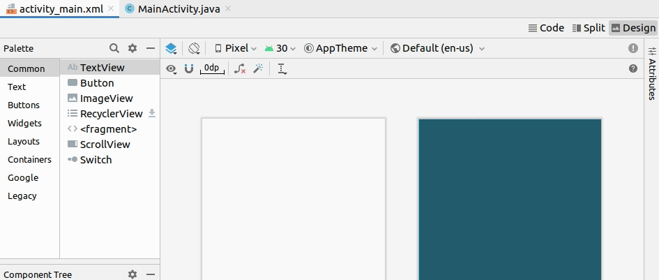
2.3 Add a second Button to the layout
- Drag another Button from the Palette pane to the middle of the layout as shown in the animated figure below. Autoconnect may provide the horizontal constraints for you (if not, you can drag them yourself).
- Drag a vertical constraint to the bottom of the layout (refer to the figure below).
You can remove constraints from an element by selecting the element and hovering your pointer over it to show the Clear Constraints  button. Click this button to remove all constraints on the selected element. To clear a single constraint, click the specific handle that sets the constraint.
To clear all constraints in the entire layout, click the Clear All Constraints tool in the toolbar. This tool is useful if you want to redo all the constraints in your layout.
The Attributes pane offers access to all of the XML attributes you can assign to a UI element. You can find the attributes (known as properties) common to all views in the View class documentation.
In this task you enter new values and change values for important Button attributes, which are applicable to most View types.
3.1 Change the Button size
The layout editor offers resizing handles on all four corners of a View so you can resize the View quickly. You can drag the handles on each corner of the View to resize it, but doing so hardcodes the width and height dimensions. Avoid hardcoding sizes for most View elements, because hardcoded dimensions can't adapt to different content and screen sizes.
Instead, use the Attributes pane on the right side of the layout editor to select a sizing mode that doesn't use hardcoded dimensions. The Attributes pane includes a square sizing panel called the view inspector at the top. The symbols inside the square represent the height and width settings as follows:
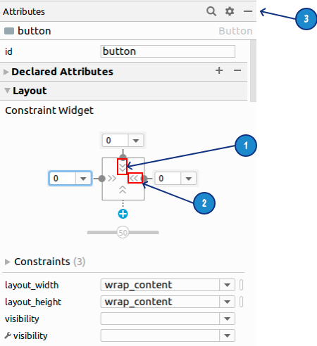
In the figure above:
- Height control. This control specifies the
layout_heightattribute and appears in two segments on the top and bottom sides of the square. The angles indicate that this control is set towrap_content, which means theViewwill expand vertically as needed to fit its contents. The "0" indicates a standard margin set to 0dp. - Width control. This control specifies the
layout_widthand appears in two segments on the left and right sides of the square. The angles indicate that this control is set towrap_content, which means theViewwill expand horizontally as needed to fit its contents, up to a margin of 0dp. - Attributes pane close button. Click to close the pane.
Follow these steps:
- Select the top
Buttonin the Component Tree pane. - Click the Attributes tab on the right side of the layout editor window.
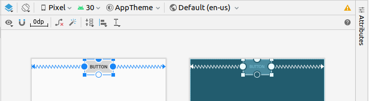
- Set the left, right, and top margins to 8dp (if not already set)
- Click the width control twice—the first click changes it to Fixed with straight lines, and the second click changes it to Match Constraints with spring coils, as shown in the animated figure below.
As a result of changing the width control, thelayout_widthattribute in the Attributes pane shows the valuematch_constraintand theButtonelement stretches horizontally to fill the space between the left and right sides of the layout. - Select the second
Button, and make the same changes to thelayout_widthas in the previous step, as shown in the figure below.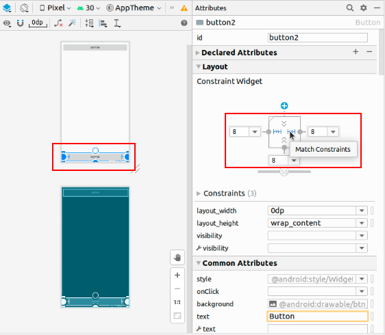
As shown in the previous steps, the layout_width and layout_height attributes in the Attributes pane change as you change the height and width controls in the inspector. These attributes can take one of three values for the layout, which is a ConstraintLayout:
- The
match_constraintsetting expands theViewelement to fill its parent by width or height—up to a margin, if one is set. The parent in this case is theConstraintLayout. You learn more aboutConstraintLayoutin the next task. - The
wrap_contentsetting shrinks theViewelement's dimensions so it is just big enough to enclose its content. If there is no content, theViewelement becomes invisible. - To specify a fixed size that adjusts for the screen size of the device, use a fixed number of density-independent pixels (
dpunits). For example,16dpmeans 16 density-independent pixels.
Tip: If you change the layout_width attribute using its popup menu, the layout_width attribute is set to zero because there is no set dimension. This setting is the same as match_constraint - the view can expand as much as possible to meet constraints and margin settings.
3.2 Change the Button attributes
To identify each View uniquely within an Activity layout, each View or View subclass (such as Button) needs a unique ID. And to be of any use, the Button elements need text. View elements can also have backgrounds that can be colors or images.
The Attributes pane offers access to all of the attributes you can assign to a View element. You can enter values for each attribute, such as the android:id, background, textColor, and text attributes.
The following animated figure demonstrates how to perform these steps:
- After selecting the first
Button, edit the ID field at the top of the Attributes pane to button_toast for theandroid:idattribute, which is used to identify the element in the layout. - Set the
backgroundattribute to @color/colorPrimary. (As you enter @c, choices appear for easy selection.) - Set the
textColorattribute to @android:color/white. - Edit the
textattribute to Toast.
- Perform the same attribute changes for the second
Button, using button_count as the ID, Count for thetextattribute, and the same colors for the background and text as the previous steps.
The colorPrimary is the primary color of the theme, one of the predefined theme base colors defined in the colors.xml resource file. It is used for the app bar. Using the base colors for other UI elements creates a uniform UI. You will learn more about app themes and Material Design in another lesson.
One of the benefits of ConstraintLayout is the ability to align or otherwise constrain elements relative to other elements. In this task you will add a TextView in the middle of the layout, and constrain it horizontally to the margins and vertically to the two Button elements. You will then change the attributes for the TextView in the Attributes pane.
4.1 Add a TextView and constraints
- As shown in the animated figure below, drag a
TextViewfrom the Palette pane to the upper part of the layout, and drag a constraint from the top of theTextViewto the handle on the bottom of the ToastButton. This constrains theTextViewto be underneath theButton.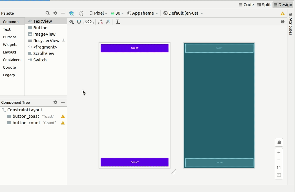
- As shown in the animated figure below, drag a constraint from the bottom of the
TextViewto the handle on the top of the CountButton, and from the sides of theTextViewto the sides of the layout. This constrains theTextViewto be in the middle of the layout between the twoButtonelements.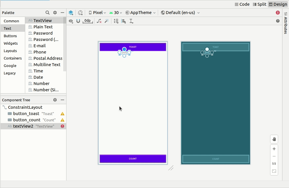
4.2 Set the TextView attributes
With the TextView selected, open the Attributes pane, if it is not already open. Set attributes for the TextView as shown in the animated figure below. The attributes you haven't encountered yet are explained after the figure:
- Set the
IDto show_count. - Set the
textto 0. - Click to expand
textAppearanceand set thetextSizeto 160sp. - Set the
textStyleto B (bold) and thetextAlignmentto ALIGNCENTER (center the paragraph).
Change the horizontal and vertical view size controls (layout_widthandlayout_height) to match_constraint. - Set the
textColorto @color/colorPrimary. - Scroll down the pane and click to expand View all attributes, scroll down the second page of attributes to
background, and then enter #FFFF00 for a shade of yellow. - Scroll down to
gravity, expandgravity, and select center_vertical (for center-vertical). - Give your
TextViewa margin of 8 all around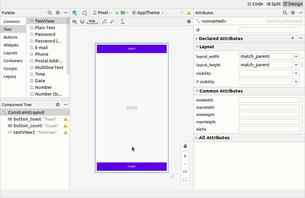
textSize: The text size of theTextView. For this lesson, the size is set to160sp. Thespstands for scale-independent pixel, and likedp, is a unit that scales with the screen density and user's font size preference. Use dp units when you specify font sizes so that the sizes are adjusted for both the screen density and the user's preference.textStyleandtextAlignment: The text style, set to B (bold) in this lesson, and the text alignment, set toALIGNCENTER(center the paragraph).gravity: Thegravityattribute specifies how aViewis aligned within its parentVieworViewGroup. In this step, you center theTextViewto be centered vertically within the parentConstraintLayout.
You may notice that the background attribute is on the first page of the Attributes pane for a Button, but on the second page of the Attributes pane for a TextView. The Attributes pane changes for each type of View. The most popular attributes for the View type appear on the first page, and the rest are listed on the second page.
The Hello Toast app layout is nearly finished! However, an exclamation point appears next to each UI element in the Component Tree. Right click on one of these exclamation points to view warnings pane, as shown below. The same warning appears for all three elements: hardcoded strings should use resources.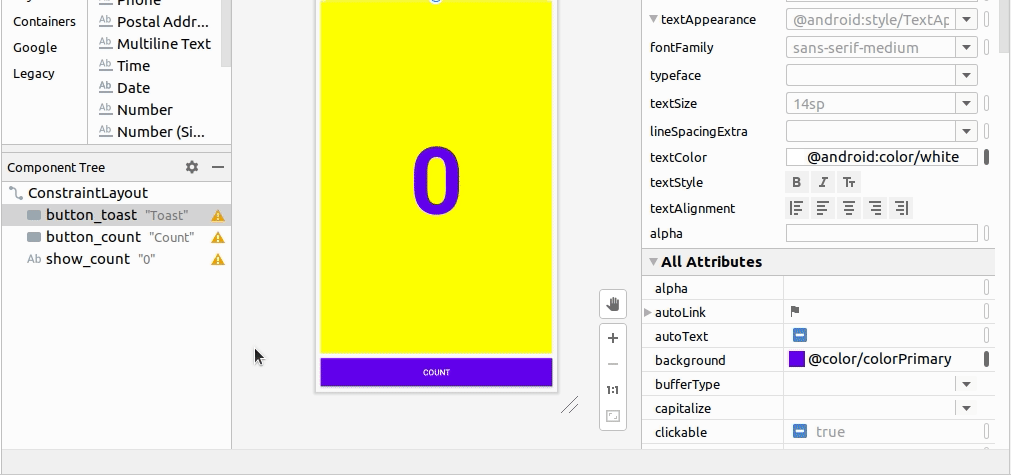
The easiest way to fix layout problems is to edit the layout in XML. While the layout editor is a powerful tool, some changes are easier to make directly in the XML source code.
5.1 Open the XML code for the layout
For this task, open the activity_main.xml file if it is not already open, and click the Code tab  at the top right of the layout editor.
The XML editor appears, replacing the design and blueprint panes. As you can see in the figure below, which shows part of the XML code for the layout, the warnings are highlighted—the hardcoded strings "Toast" and "Count". (The hardcoded "0" is also highlighted but not shown in the figure.) Hover your pointer over the hardcoded string "Toast" to see the warning message.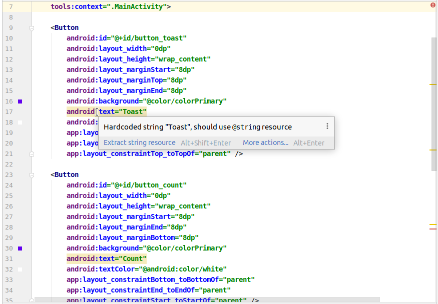
5.2 Extract string resources
Instead of hard-coding strings, it is a best practice to use string resources, which represent the strings. Having the strings in a separate file makes it easier to manage them, especially if you use these strings more than once. Also, string resources are mandatory for translating and localizing your app, because you need to create a string resource file for each language.
- Click once on the word
"Toast"(the first highlighted warning). - Press Alt-Enter in Windows/Linux or Option-Enter in macOS and choose Extract string resource from the popup menu.
- Enter button_label_toast for the Resource name.
- Click OK. A string resource is created in the
values/res/string.xmlfile, and the string in your code is replaced with a reference to the resource:@string/button_label_toast - Extract the remaining strings:
button_label_countfor"Count", andcount_initial_valuefor"0". - In the Project > Android pane, expand res and then expand values within res, and double-click strings.xml to see your string resources in the
strings.xmlfile:<resources> <string name="app_name">HelloToast</string> <string name="button_label_toast">Toast</string> <string name="button_label_count">Count</string> <string name="count_initial_value">0</string> </resources> - You need another string to use in a subsequent task that displays a message. Add to the
strings.xmlfile another string resource namedtoast_messagefor the phrase"Hello Toast!":<resources> <string name="app_name">HelloToast</string> <string name="button_label_toast">Toast</string> <string name="button_label_count">Count</string> <string name="count_initial_value">0</string> <string name="toast_message">Hello Toast!</string> </resources>
Tip: The string resources include the app name, which appears in the app bar at the top of the screen if you start your app project using the Empty Template. You can change the app name by editing the app_name resource.
In this task, you add a Java method for each Button in MainActivity that executes when the user taps the Button.
6.1 Add the onClick attribute and handler to each Button
A click handler is a method that is invoked when the user clicks or taps on a clickable UI element. In Android Studio you can specify the name of the method in the onClick field in the Design tab's Attributes pane. You can also specify the name of the handler method in the XML editor by adding the android:onClick property to the Button. You will use the latter method because you haven't yet created the handler methods, and the XML editor provides an automatic way to create those methods.
- With the XML editor open (the Text tab), find the
Buttonwith theandroid:idset tobutton_toast:<Button android:id="@+id/button_toast" android:layout_width="0dp" ... app:layout_constraintStart_toStartOf="parent" app:layout_constraintTop_toTopOf="parent" /> - Add the
android:onClickattribute to the end of thebutton_toastelement after the last attribute and before the/>end indicator:<Button android:id="@+id/button_toast" ... app:layout_constraintTop_toTopOf="parent" android:onClick="showToast" /> - Click the red bulb icon that appears next to attribute. Select Create ‘showToast(View)' in ‘MainActivity', and the
MainActivityclass will be opened in the editor with a new method calledshowToast.
If the red bulb icon doesn't appear, click the method name ("showToast"). Press Alt-Enter (Option-Enter on the Mac), select Create ‘showToast(view)' in ‘MainActivity', and click OK.
This action creates a placeholder method stub for the showToast() method in MainActivity, as shown in the animated image below: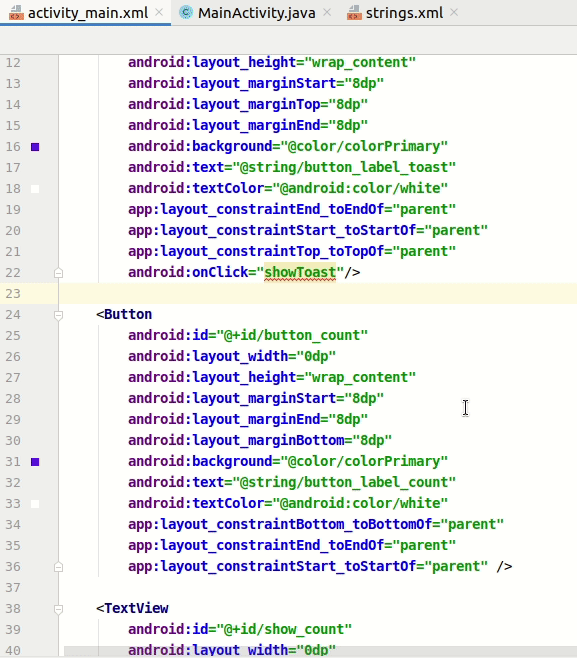
- Repeat the last two steps with the
button_countButton: Add theandroid:onClickattribute to the end, and add the click handler:
The XML code for the UI elements within<Button android:id="@+id/button_count" ... app:layout_constraintStart_toStartOf="parent" android:onClick="countUp" />activity_main.xmlnow looks like this:<?xml version="1.0" encoding="utf-8"?> <androidx.constraintlayout.widget.ConstraintLayout xmlns:android="http://schemas.android.com/apk/res/android" xmlns:app="http://schemas.android.com/apk/res-auto" xmlns:tools="http://schemas.android.com/tools" android:layout_width="match_parent" android:layout_height="match_parent" tools:context=".MainActivity"> <Button android:id="@+id/button_toast" android:layout_width="0dp" android:layout_height="wrap_content" android:layout_marginStart="8dp" android:layout_marginTop="8dp" android:layout_marginEnd="8dp" android:background="@color/colorPrimary" android:text="@string/button_label_toast" android:textColor="@android:color/white" app:layout_constraintEnd_toEndOf="parent" app:layout_constraintStart_toStartOf="parent" app:layout_constraintTop_toTopOf="parent" android:onClick="showToast" /> <Button android:id="@+id/button_count" android:layout_width="0dp" android:layout_height="wrap_content" android:layout_marginStart="8dp" android:layout_marginEnd="8dp" android:layout_marginBottom="8dp" android:background="@color/colorPrimary" android:text="@string/button_label_count" android:textColor="@android:color/white" app:layout_constraintBottom_toBottomOf="parent" app:layout_constraintEnd_toEndOf="parent" app:layout_constraintStart_toStartOf="parent" android:onClick="countUp" /> <TextView android:id="@+id/show_count" android:layout_width="0dp" android:layout_height="0dp" android:layout_marginStart="8dp" android:layout_marginTop="8dp" android:layout_marginEnd="8dp" android:layout_marginBottom="8dp" android:background="#FFFF00" android:gravity="center_vertical" android:text="@string/count_initial_value" android:textAlignment="center" android:textColor="@color/colorPrimary" android:textSize="160sp" android:textStyle="bold" app:layout_constraintBottom_toTopOf="@+id/button_count" app:layout_constraintEnd_toEndOf="parent" app:layout_constraintStart_toStartOf="parent" app:layout_constraintTop_toBottomOf="@+id/button_toast" /> </androidx.constraintlayout.widget.ConstraintLayout> - If
MainActivity.javais not already open, expand java in the Project > Android view, expanduk.aston.hellotoast, and then double-click MainActivity. The code editor appears with the code inMainActivity:package uk.aston.hellotoast; import androidx.appcompat.app.AppCompatActivity; import android.os.Bundle; import android.view.View; public class MainActivity extends AppCompatActivity { @Override protected void onCreate(Bundle savedInstanceState) { super.onCreate(savedInstanceState); setContentView(R.layout.activity_main); } public void showToast(View view) { } public void countUp(View view) { } }
6.2 Edit the Toast Button handler
You will now edit the showToast() method—the ToastButton click handler in MainActivity - so that it shows a message. A Toast provides a way to show a simple message in a small popup window. It fills only the amount of space required for the message. The current activity remains visible and interactive. A Toast can be useful for testing interactivity in your app - add a Toast message to show the result of tapping a Button or performing an action.
Follow these steps to edit the ToastButton click handler:
Locate the newly created showToast() method.
public void showToast(View view) {
}
- To create an instance of a
Toast, call the makeText() factory method on the Toast class.public void showToast(View view) { Toast toast = Toast.makeText( } - Supply the context of the app
Activity. Because aToastdisplays on top of theActivityUI, the system needs information about the currentActivity. When you are already within the context of theActivitywhose context you need, usethisas a shortcut.Toast toast = Toast.makeText(this, - Supply the message to display, such as a string resource (the
toast_messageyou created in a previous step). The string resourcetoast_messageis identified byR.string.Toast toast = Toast.makeText(this, R.string.toast_message, - Supply a duration for the display. For example, Toast.LENGTH_SHORT displays the toast for a relatively short time.
The duration of aToast toast = Toast.makeText(this, R.string.toast_message, Toast.LENGTH_SHORT);Toastdisplay can be eitherToast.LENGTH_LONGorToast.LENGTH_SHORT. The actual lengths are about 3.5 seconds for the longToastand 2 seconds for the shortToast. - Show the
Toastby callingshow(). The following is the entireshowToast()method:public void showToast(View view) { Toast toast = Toast.makeText(this, R.string.toast_message, Toast.LENGTH_SHORT); toast.show(); }
Run the app and verify that the Toast message appears when the Toast button is tapped.
6.3 Edit the Count Button handler
You will now edit the countUp() method—the CountButton click handler in MainActivity - so that it displays the current count after Count is tapped. Each tap increases the count by one.
The code for the handler must:
- Keep track of the count as it changes.
- Send the updated count to the
TextViewto display it.
Follow these steps to edit the CountButton click handler:
- Locate the newly created
countUp()method.public void countUp(View view) { } - To keep track of the count, you need a private member variable. Each tap of the Count button increases the value of this variable. Enter the following, which will be highlighted in red and show a red bulb icon:
If the red bulb icon doesn't appear, click thepublic void countUp(View view) { mCount++; }mCount++expression. The red bulb eventually appears.
Click the red bulb icon and choose Create field ‘mCount' in ‘MainActivity' from the popup menu. This creates a private member variable at the top of MainActivity, and Android Studio assumes that you want it to be an integer (int). If you press Enter to accept theinttype, that will complete the operation. Watch this animated image to see it done:
- Locate the
onCreate()method inMainActivityand add a line to initialise the private member variable to zero:@Override protected void onCreate(Bundle savedInstanceState) { super.onCreate(savedInstanceState); setContentView(R.layout.activity_main); mCount = 0; } - We want to display the value of the
mCountvariable on the screen of our app using theTextViewwhose ID we set to beshow_count. You need to get a reference to theTextViewusing the ID you set in the layout file. In order to get this reference only once, specify it in theonCreate()method. As you learn in another lesson, theonCreate()method is used to inflate the layout, which means to set the content view of the screen to the XML layout. You can also use it to get references to other UI elements in the layout, such as theTextView. - Add a call to
findViewByIdto the end of youronCreatemethod to find and return theTextViewwhich has the ID valueshow_count:
A@Override protected void onCreate(Bundle savedInstanceState) { super.onCreate(savedInstanceState); setContentView(R.layout.activity_main); mCount = 0; mShowCount = (TextView) findViewById(R.id.show_count); }View, like a string, is a resource that can have an id. The findViewById call takes the ID of a view as its parameter and returns theView. Because the method returns aView, you have to cast the result to the view type you expect, in this case (TextView). - Once again, click the red bulb at the start of the line and select Create field ‘mShowCount' in ‘MainActivity' and click Enter to accept the type
TextView. You should now have two member variables inMainActivity:private int mCount; private TextView mShowCount; - Now that you have assigned the
TextViewtomShowCount, you can usemShowCountto set the text in theTextViewto the value of themCountvariable. Add the following code to thecountUp()method:
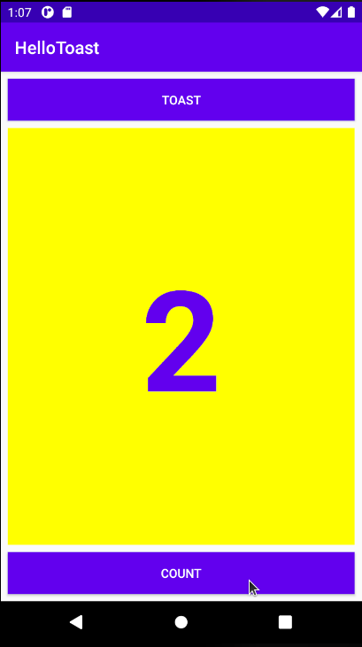
The entireif (mShowCount != null) { mShowCount.setText(Integer.toString(mCount)); }countUp()method now looks like this:public void countUp(View view) { mCount++; if (mShowCount != null) { mShowCount.setText(Integer.toString(mCount)); } } - Run the app to verify that the count increases when you tap the Count button.
Tip: For an in-depth tutorial on using ConstraintLayout, see the Codelab entitled Using ConstraintLayout to design your views.
You can find a ZIP of the Android Studio project: HelloToast on Blackboard.
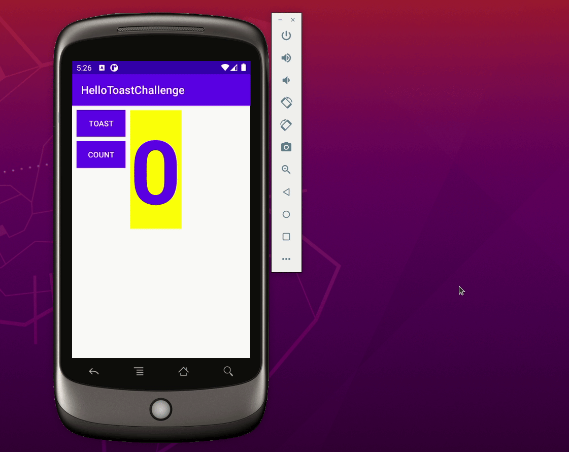
The HelloToast app looks fine when the device or emulator is vertically oriented. However, if you switch the device or emulator to horizontal orientation, the CountButton may overlap the TextView along the bottom depending on the screen resolution of the emulated device. Watch the animated image below to see what happens when we run the app on a Nexus One and configure the emulator to rotate the screen when the orientation changes from portrait to landscape and vice versa: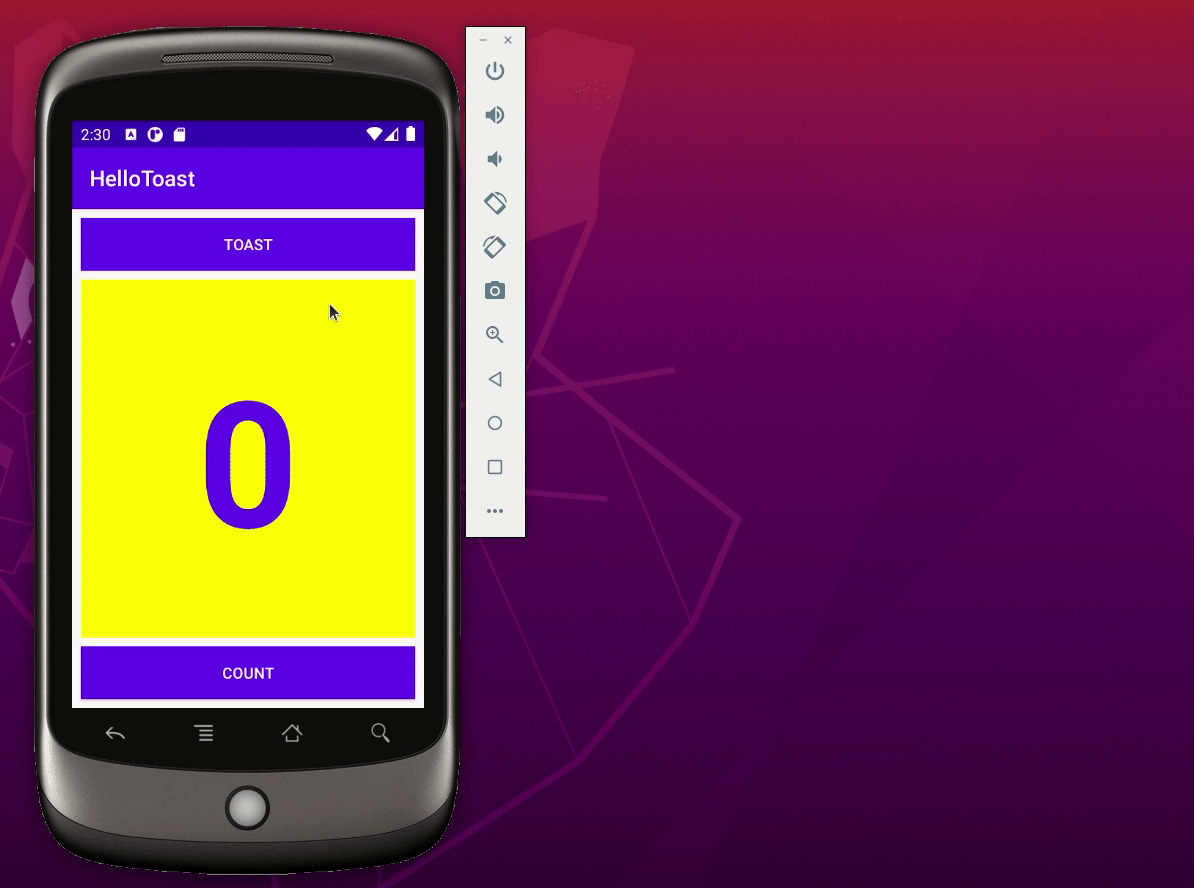
Challenge: Change the layout so that it looks good in both horizontal and vertical orientations:
Copy, rename and refactor the project
If you copy a project and want to work on the copy, you should rename and refactor the copy. In the following steps we are going to do that for the HelloToast project. Here are the steps to refactor the project:
- If the original project is still open in Android Studio, close it by selecting File > Close Project and use your system file navigator to find the folder containing the project
- Copy the
HelloToastfolder to a new location and rename it HelloToastChallenge - In Android Studio, select Open an existing Android Studio project and open the renamed HelloToastChallenge project in Android Studio
- Select Build > Clean Project to remove the auto-generated files.
- If it is not already visible, click the 1:Project side-tab and choose Android from the drop-down menu to see your files in the Project: Android view.
- Expand the app > java folder.
- Right-click
uk.aston.hellotoastand select Refactor > Rename. A Warning dialog is displayed. Select Rename package. - The Rename dialog is displayed. Give a new name to your project,
hellotoastchallenge. - Select both Search in comments and strings and Search for text occurrences. Click Refactor.
- The Find: Refactoring Preview pane appears, showing the code to be refactored. Click Do Refactor.
- Expand the res > values folder and double-click the
strings.xmlfile. - Change the
app_namestring value toHelloToastChallenge. - Check the
AndroidManifest.xmland ensure that the package name has been refactored. The opening element should look like this:<manifest xmlns:android="http://schemas.android.com/apk/res/android" package="uk.aston.hellotoastchallenge"> - Open
build.gradle(Module: app)and ensure that theapplicatioIdhas been renamed:defaultConfig { applicationId "uk.aston.hellotoastchallenge" - Open
settings.gradle(Project Settings)and ensure that therootProject.namehas been updated. That file should look like this:
After you change the value ofinclude ':app' rootProject.name = "HelloToastChallenge"rootProject.name, click Sync now which should appear at the top right hand corner of the Android Studio editor window.
Tip: Another way to sync your Gradle files is to select File > Sync Project with Gradle Files. - You should now be able to rebuild your project by selecting Build > Rebuild Project.
- Once the project is built you should be able to run it on the emulator.
Here is an animate image of the above steps (if this image is too small, try right clicking the image and choose Open image in new tab):
Change the layout
- Change the layout so that the Toast
Buttonand CountButtonappear on the left side, as shown in the figure below. TheTextViewappears next to them, but only wide enough to show its contents. (Hint: Uselayout_widthandlayout_heightset towrap_contentbefore you add the layout constraints. You can remove all the constraints by clicking ) on the toolbar.)
 - Run the app in both horizontal and vertical orientations.
View, ViewGroup, and layouts:
- All UI elements are subclasses of the View class and therefore inherit many properties of the
Viewsuperclass. Viewelements can be grouped inside a ViewGroup, which acts as a container. The relationship is parent-child, in which the parent is aViewGroup, and the child is aViewor anotherViewGroup.- The
onCreate()method is used to inflate the layout, which means to set the content view of the screen to the XML layout. You can also use it to get references to other UI elements in the layout. - A
View, like a string, is a resource that can have an id. The findViewById call takes the ID of a view as its parameter and returns theView.
Using the layout editor:
- Click the Design tab to manipulate elements and the layout, and the Code tab to edit the XML code for the layout.
- In the Design tab, the Palettes pane shows UI elements that you can use in your app's layout, and the Component tree pane shows the view hierarchy of UI elements.
- The design and blueprint panes of the layout editor show the UI elements in the layout.
- The Attributes tab displays the Attributes pane for setting properties for a UI element.
- Constraint handle: Click a constraint handle, shown as a circle on each side of an element, and then drag to another constraint handle or to parent boundary to create a constraint. The constraint is represented by the zigzag line.
- Resizing handle: You can drag the square resizing handles to resize the element. While dragging, the handle changes to an angled corner.
- When enabled, the Autoconnect tool automatically creates two or more constraints for a UI element to the parent layout. After you drag the element to the layout, it creates constraints based on the element's position.
- You can remove constraints from an element by selecting the element and hovering your pointer over it to show the Clear Constraints button. Click this button to remove all constraints on the selected element. To clear a single constraint, click the specific handle that sets the constraint.
- The Attributes pane offers access to all of the XML attributes you can assign to a UI element. It also includes a square sizing panel called the view inspector at the top. The symbols inside the square represent the height and width settings.
Setting layout width and height:
The layout_width and layout_height attributes change as you change the height and width size controls in the view inspector. These attributes can take one of three values for a ConstraintLayout:
- The
match_constraintsetting expands the view to fill its parent by width or height—up to a margin, if one is set. - The
wrap_contentsetting shrinks the view dimensions so the view is just big enough to enclose its content. If there is no content, the view becomes invisible. - Use a fixed number of
dp(density-independent pixels) to specify a fixed size, adjusted for the screen size of the device.
Extracting string resources:
Instead of hard-coding strings, it is a best practice to use string resources, which represent the strings. Follow these steps:
- Click once on the hardcoded string to extract, press Alt-Enter (Option-Enter on the Mac), and choose Extract string resources from the popup menu.
- Set the Resource name.
- Click OK. This creates a string resource in the
values/res/string.xmlfile, and the string in your code is replaced with a reference to the resource:@string/button_label_toast
Handling clicks:
- A click handler is a method that is invoked when the user clicks or taps on a UI element.
- Specify a click handler for a UI element such as a
Buttonby entering its name in theonClickfield in the Design tab's Attributes pane, or in the XML editor by adding theandroid:onClickproperty to a UI element such as aButton. - Create the click handler in the main
Activityusing theViewparameter. Example:public void showToast(View view) {/...}. - You can find information on all
Buttonproperties in the Button class documentation, and all theTextViewproperties in the TextView class documentation.
Displaying Toast messages:
- A Toast provides a way to show a simple message in a small popup window. It fills only the amount of space required for the message. To create an instance of a
Toast, follow these steps: - Call the
makeText()factory method on theToastclass. - Supply the context of the app
Activityand the message to display (such as a string resource). - Supply the duration of the display, for example
Toast.LENGTH_SHORTfor a short period. The duration can be eitherToast.LENGTH_LONGorToast.LENGTH_SHORT. - Show the
Toastby callingshow().
The related concept documentation is in 1.2: Layouts and resources for the UI.